Press Love: Charlotte Home Design & Decor / March 2018
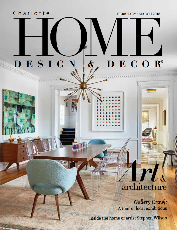
I am happy share a fabulous project in the current Charlotte Home Design & Decor Magazine.
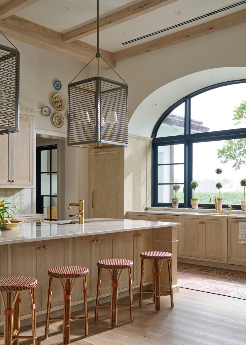
This stunning home was designed by architect Ruard Veltman and no detail was left unturned.
I had the please of adding some colorful touches to the architectural gem.
Enjoy!
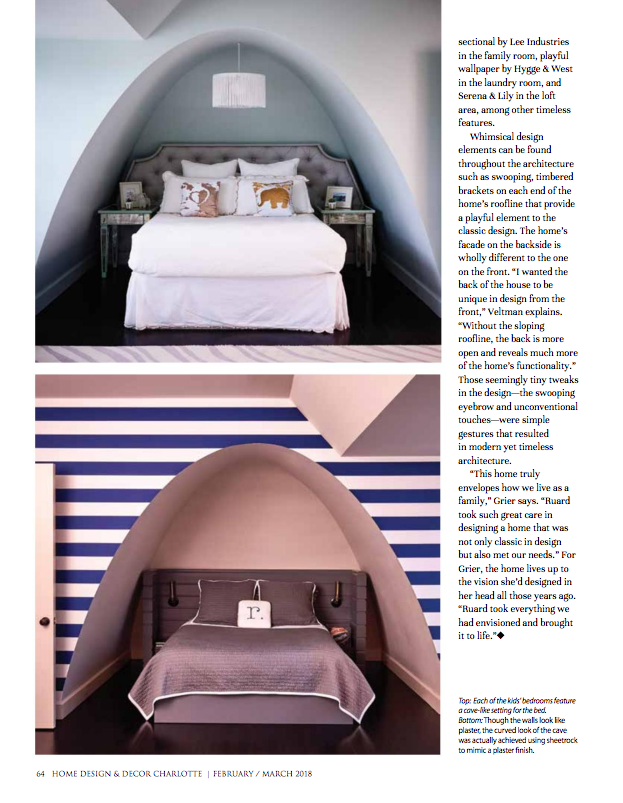
Here is the full article and additional images from HERE. All images by Dustin Peck.
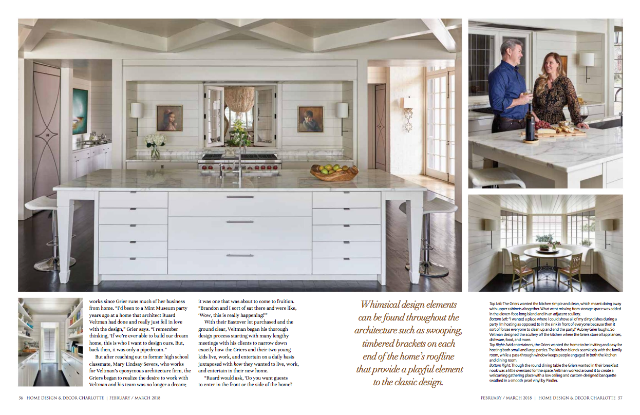
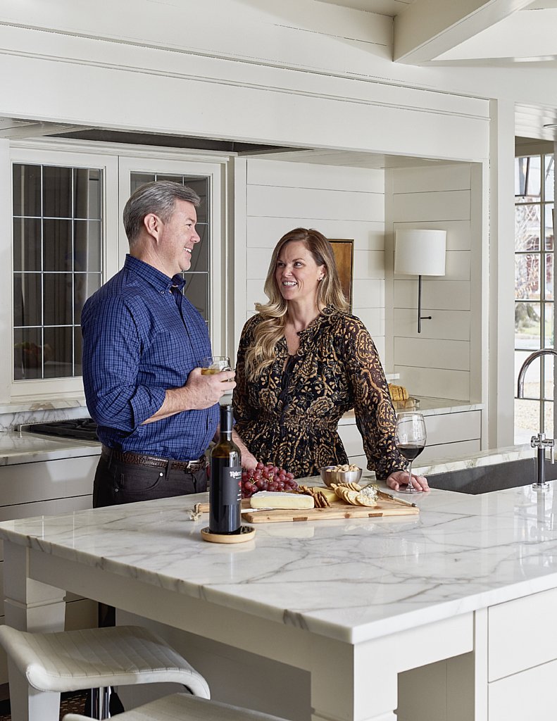
Aubrey Grier had pieced together the perfect home several times in her mind over the last seventeen years. As a realtor with Dickens Michener, Grier was accustomed to viewing a lot of homes throughout the Charlotte area, so she would fall in love with certain aspects of each property, mentally piecing together what her dream home would be if she could build it from the ground up. “I would take the outdoor porch from this one, the kitchen from that one, the foyer from the other,” she laughs.
The daydreaming was as much about what she wanted as it was what she didn’t want. “After seeing so many houses all these years, I truly got a sense for what wouldn’t work for our family.” A large, formal, often-unused dining room and a massive amount of square footage that would be rarely employed in their entertaining or everyday living as a family of four were just two things the Griers didn’t want.
So when Grier and her husband, Brandon, purchased their lot in Eastover to build their dream home, they had a list of dos and don’ts. They also knew exactly who they wanted to design their home. Someone – someone who would take into consideration not only their criteria but also the way the family lives, entertains, and works since Grier runs much of her business from home. “I’d been to a Mint Museum party years ago at a home that architect Ruard Veltman had done and really just fell in love with the design,” Grier says. “I remember thinking, ‘If we’re ever able to build our dream home, this is who I want to design ours. But, back then, it was only a pipedream.”
But after reaching out to former high school classmate, Mary Lindsay Severs, who works for Veltman’s eponymous architecture firm, the Griers began to realize the desire to work with Veltman and his team was no longer a dream; it was one that was about to come to fruition. “Brandon and I sort of sat there and were like, ‘Wow, this is really happening!’”
With their Eastover lot purchased and the ground clear, Veltman began his thorough design process starting with many lengthy meetings with his clients to narrow down exactly how the Griers and their two young kids live, work, and entertain on a daily basis juxtaposed with how they wanted to live, work, and entertain in their new home.
“Ruard would ask, ‘Do you want guests to enter in the front or the side of the home? Do you want an overhang that covers two people or ten? How many wine glasses do you have? How wide are they? He was so thorough in nailing down to even the smallest detail how the home should be designed to fit our everyday life as well as take into account what we wanted in the home,” Grier says.
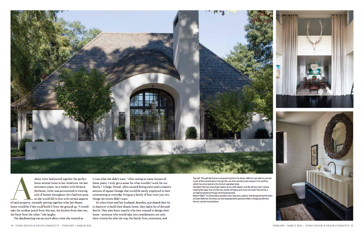
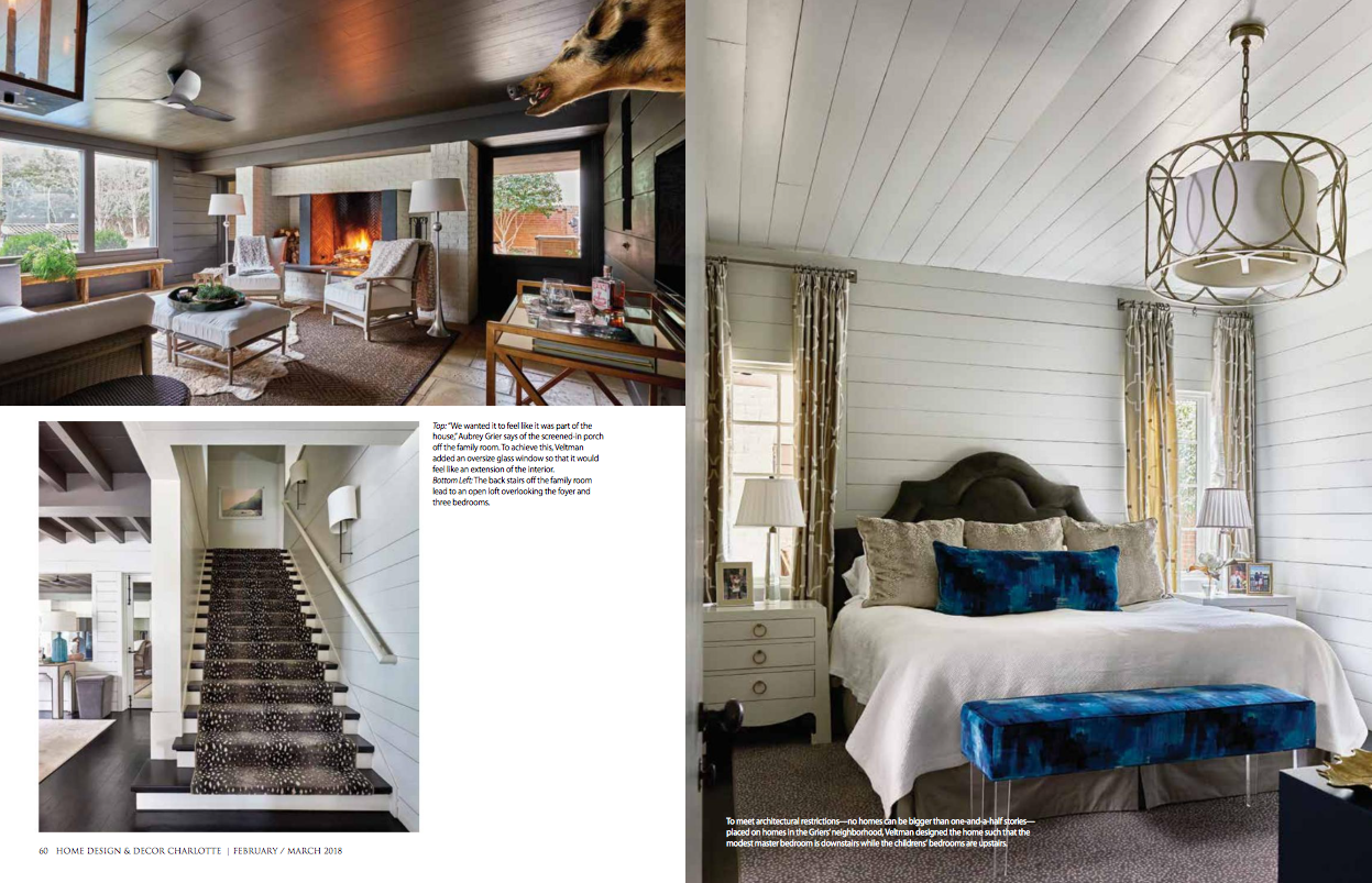
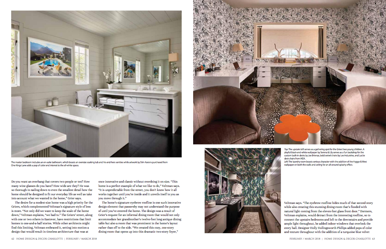
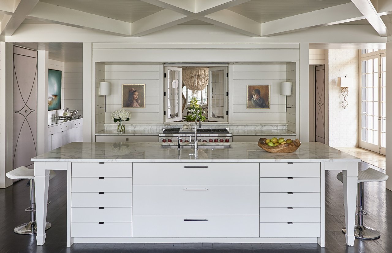
The desire for a modest-size home was a high priority for the Griers, which complemented Veltman’s signature style of less is more. “Not only did we want to keep the scale of the home down,” Veltman explains, “we had to.” The Griers’ street, along with one or two others in Eastover, have restrictions that limit homes to one-and-a-half stories. While other architects might find this limiting, Veltman embraced it, setting into motion a design that would result in timeless architecture that was at once innovative and classic without overdoing it on size. “This home is a perfect example of what we like to do,” Veltman says. “It is unpredictable from the street, you don’t know how it all works together until you’re inside and it unveils itself to you as you move through it.”
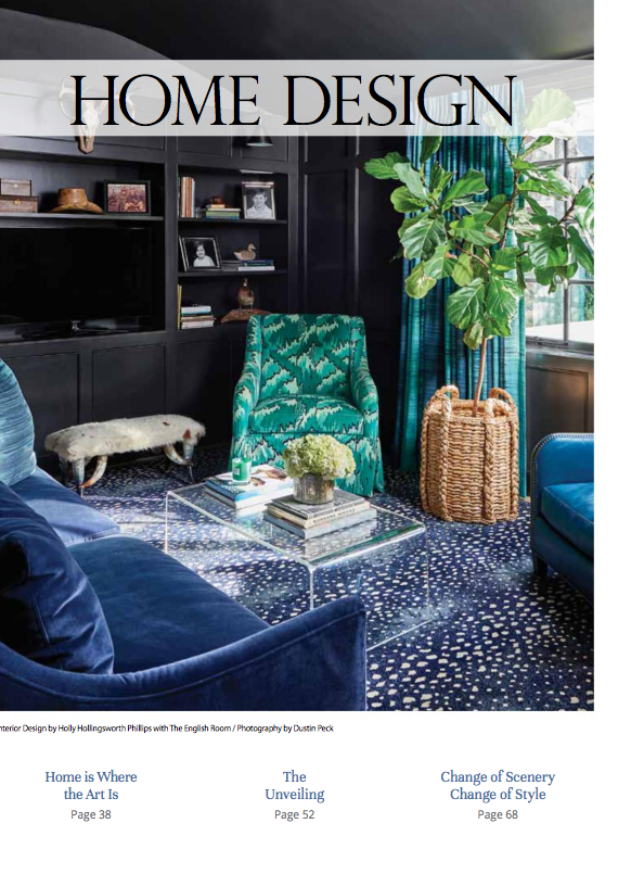
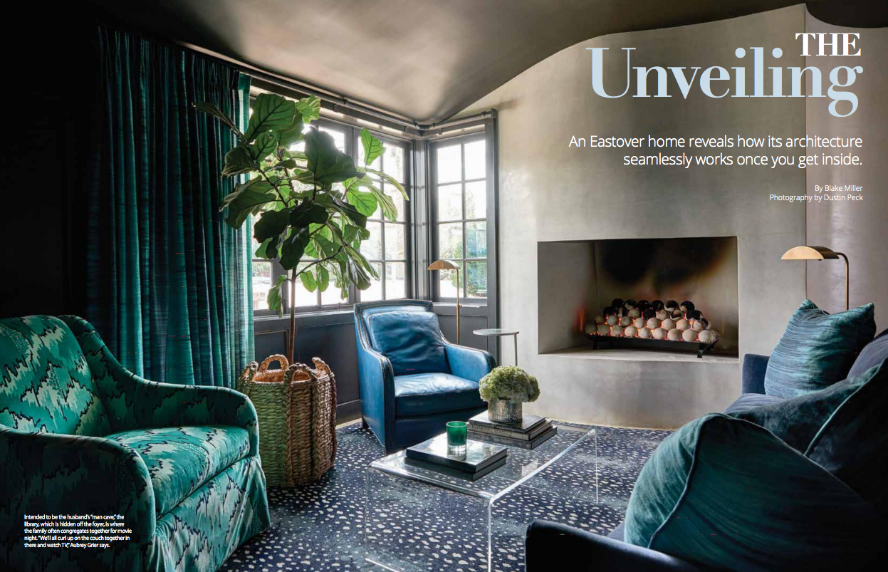
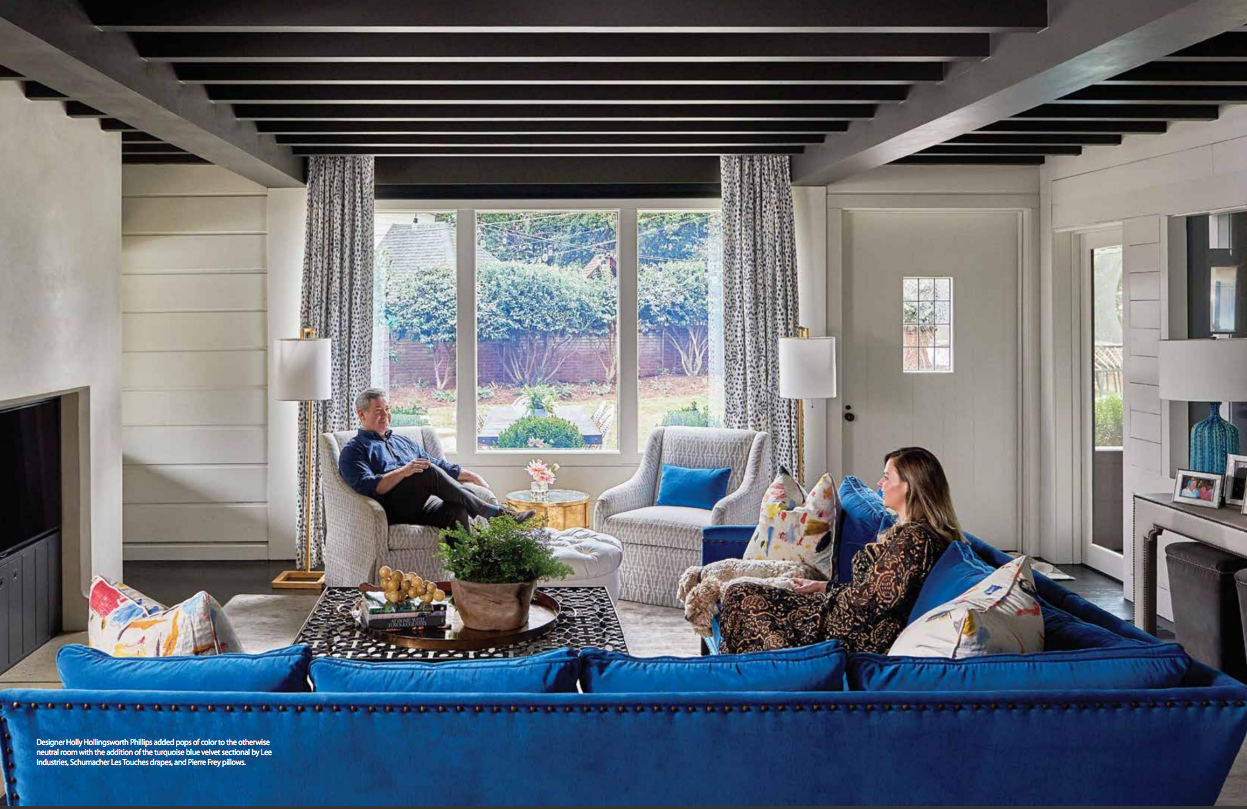
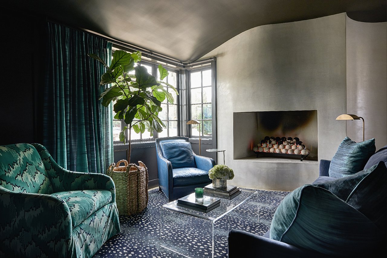
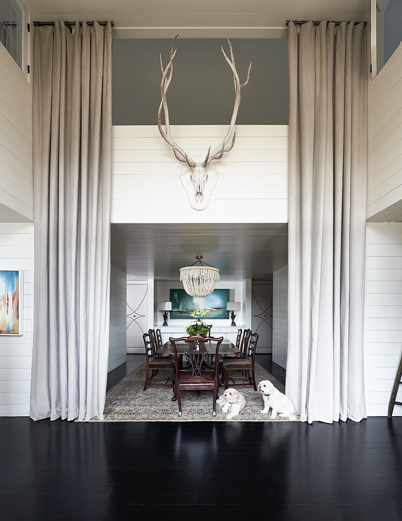
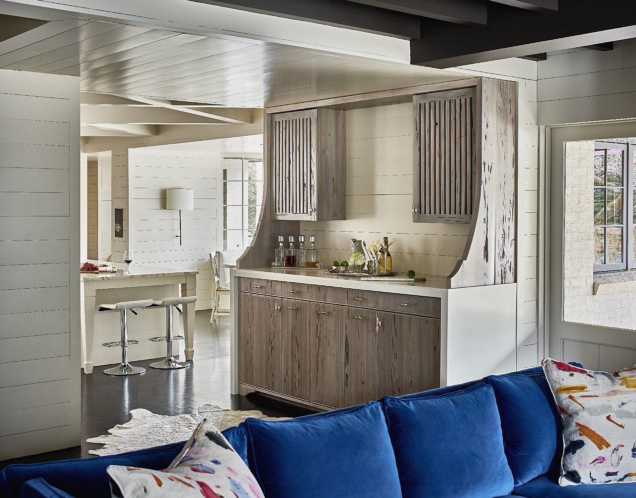
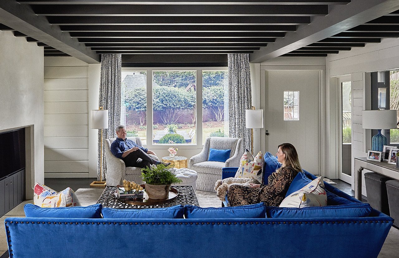
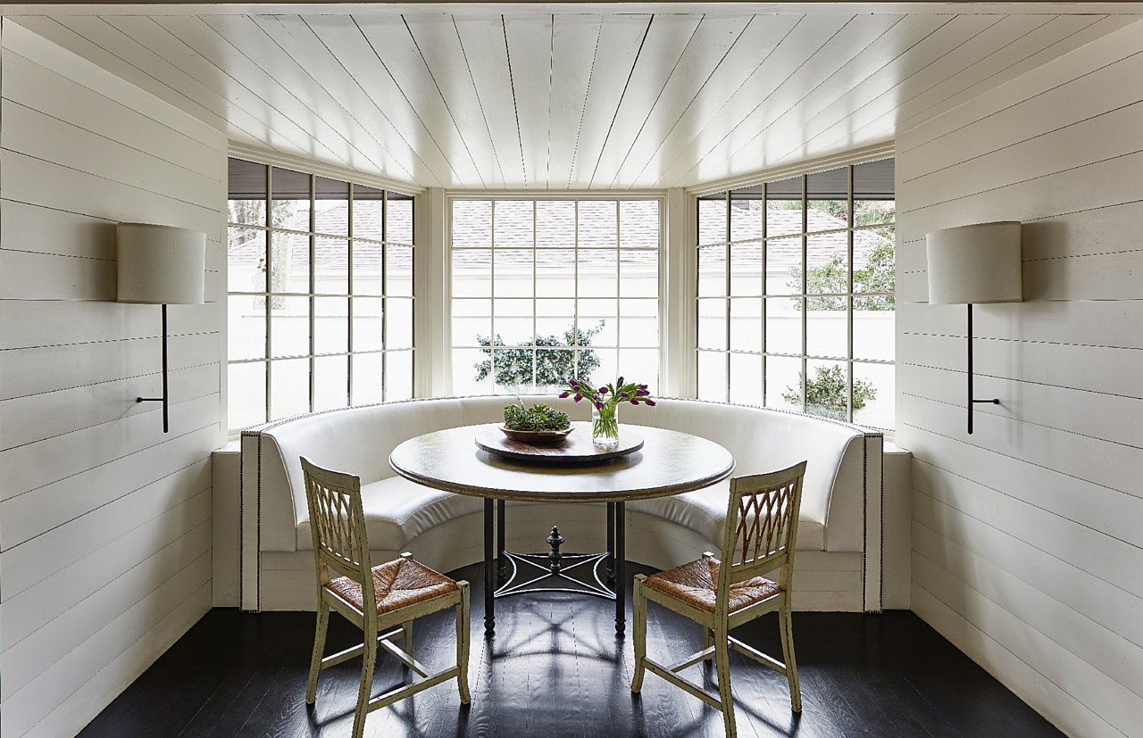
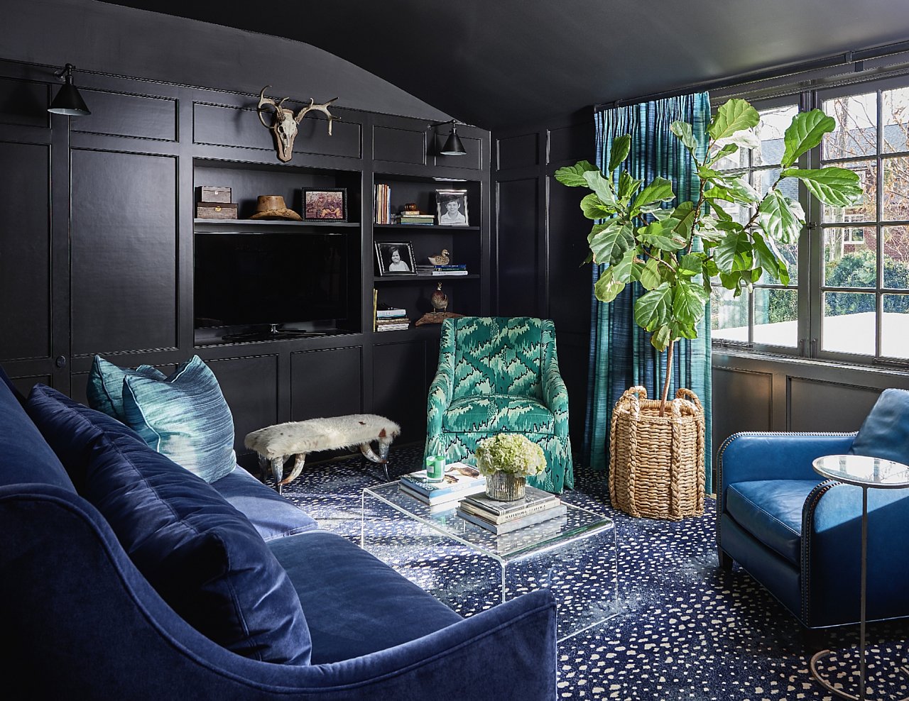
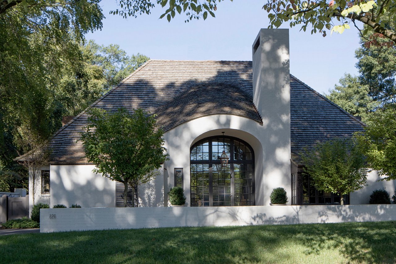
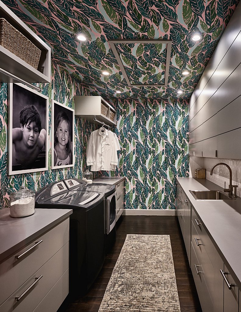
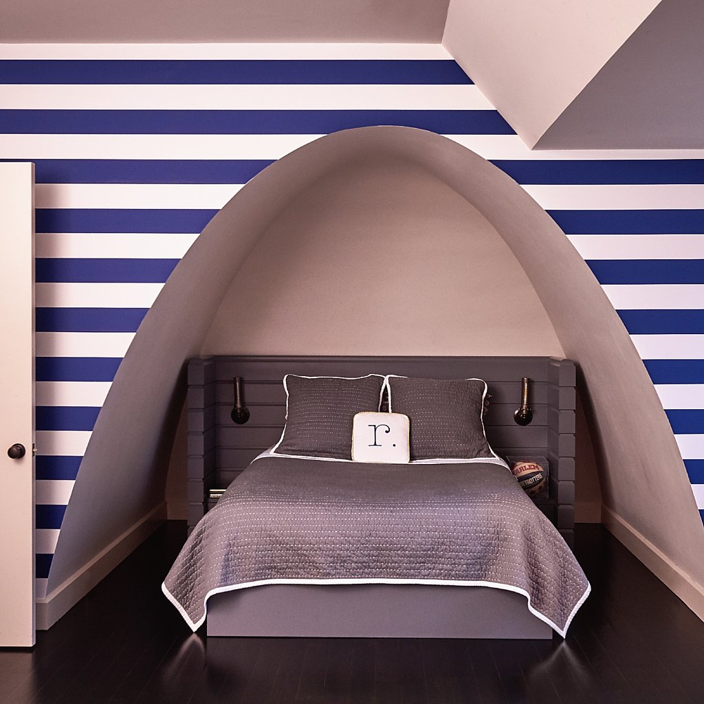
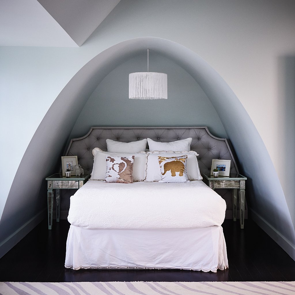
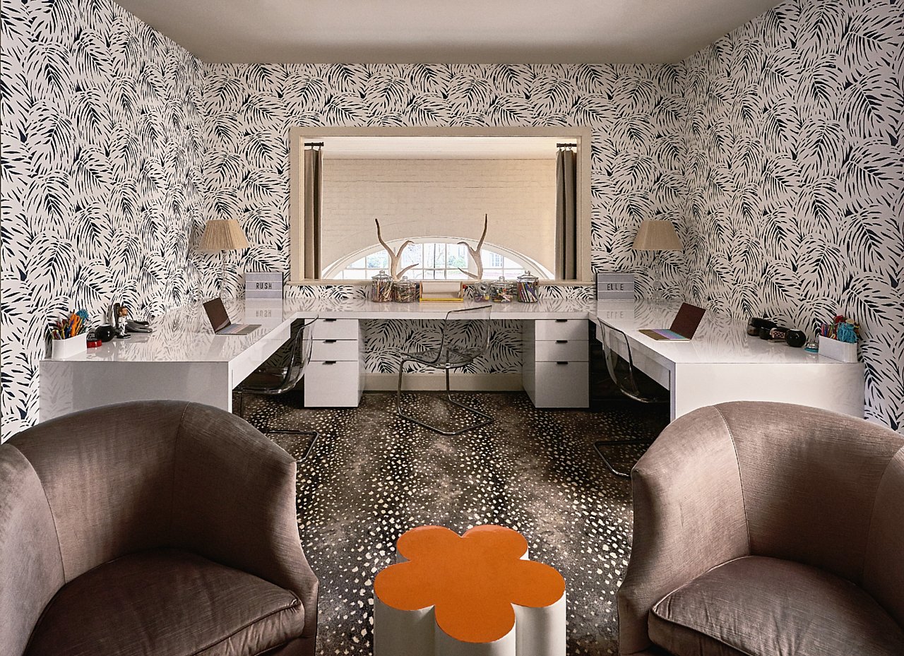
The home’s signature eyebrow roofline is one such innovative design element that passersby may not understand the purpose of until you’ve entered the home. The design was a result of Grier’s request for an informal dining room that would not only accommodate her grandmother’s twelve-foot long antique dining table but also a room that was prominent in the home’s layout rather than off to the side. “We created this cozy, one-story dining room that opens up into this dramatic two-story foyer,” Veltman says. “The eyebrow roofline hides much of that second story while also creating this stunning dining room that’s flooded with natural light coming from the eleven-foot glass front door.” Dormers, Veltman explains, would detract from the interesting roofline, so to connect the upstairs bedrooms and loft to the downstairs and provide ample light throughout, he added indoor windows that overlook the entry hall. Designer Holly Hollingsworth Phillips added pops of color and texture throughout with the addition of a turquoise blue velvet sectional by Lee Industries in the family room, playful wallpaper by Hygge & West in the laundry room, and Serena & Lily in the loft area, among other timeless features.
Whimsical design elements can be found throughout the architecture such as swooping, timbered brackets on each end of the home’s roofline that provide a playful element to the classic design. The home’s facade on the backside is wholly different to the one on the front. “I wanted the back of the house to be unique in design from the front,” Veltman explains.
“Without the sloping roofline, the back is more open and reveals much more of the home’s functionality.” Those seemingly tiny tweaks in the design—the swooping eyebrow and unconventional touches—were simple gestures that resulted in modern yet timeless architecture. “This home truly envelopes how we live as a family,” Grier says. “Ruard took such great care in designing a home that was not only classic in design but also met our needs.” For Grier, the home lives up to the vision she’d designed in her head all those years ago. “Ruard took everything we had envisioned and brought it to life.”
Shop my Valentine’s Day Gift Guide.
Be sure to subscribe to THE ENGLISH ROOM for extra news, giveaways and discounts.
Let’s get friendly on Facebook, Twitter, Pinterest, Tumblr & Instagram.
Please feel free to contact The English Room if you are interested in our interior design services.
Sorry, the comment form is closed at this time.


Cenepk10
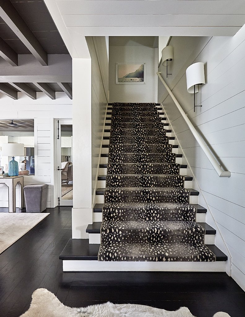
Oh My Goodness…. What a truly modern home ! Gorgeous job, Holly. Stunning!!! Laundry & Office are my favorites & the stair carpet. Ahhhhhhhh.