My Beach Vacation in the Lively Tower
Charleston Home: Lively Tower
Written By Ellen McGauley
Photographs by Peter Frank Edwards
With penthouse views, vibrant hues, and a come-as-you-are vibe, this Isle of Palms summer home revises
beachhouse basics
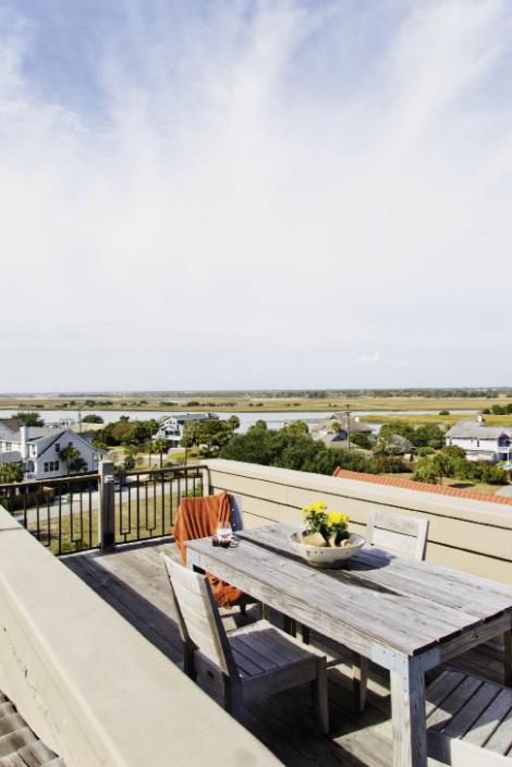
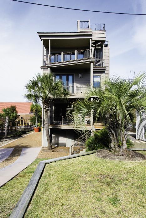
You have to give Brad Murr and interior designer Cortney Bishop credit for thinking inside the box. Straight up and down and neatly stacked, the three-story vacation home they designed on the Isle of Palms has a place for everything—a trio of beach-bright bunk rooms and a Moroccan-themed banquette, a penthouse living room and salty breezes drifting end to end, a high-flying rooftop deck and even a shot of rock ’n’ roll.
Symmetrical, as it turns out, doesn’t have to mean straight-laced. “Brad wanted a house that was fun, that fit his family and a party or two as well, ” says Cortney, adding that her clients’ workaday home is three hours away in Charlotte. “Escape was the idea. Think ‘boutique hotel, ’” she says.
It’s a smart idea, particularly when you’ve found your go-to getaway. Murr began bringing his family—wife Alli; four children, now ranging in age from four to 12; and two dogs—to the island around 2005. It was a southern migration, of sorts, from their vacation mainstay just up the road in Wrightsville Beach, North Carolina. “We identified with the culture of IOP immediately, particularly the south side, ” says Murr. “It’s very neighborhoody, less commercial, especially in the high season. The beach and the streets are very natural; they keep a lower profile.”
So, too, does the Intracoastal Waterway—just three blocks from the family’s lot—compared to the oceanfront views toward which most flock. “We liked the idea of building with the back side of the island in mind, ” he says. “With this tower design and inverted floorplan, we can see the ocean from the living room, but we also have a view of the waterway, downtown, the Ravenel Bridge—it’s a more complete story.”
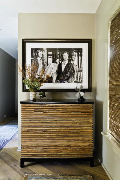
And as with any good story, there’s a hook—in this case, a hint just behind the earthy, lap-siding facade that kicking back, even whooping it up, is welcome. “Right inside the entrance, we hung a large black-and-white photo of The Doors over a contemporary, Brazilian wood chest, ” says Cortney—a nod, she says, to Brad’s affinity for live music, not to mention the family’s easygoing vibe.
And there’s another clue, this one underfoot: On the first and third floors, Cortney set the white-oak flooring on a diagonal. It’s a subtle, off-kilter echo of the rock ’n’ roll welcome and bunk rooms on the ground floor, and the eat-drink-and-be-merry mood further up (more on that in a moment…).
“Rather than one being an extension of the last, I wanted to really differentiate among the floors, ” says Cortney.
“This was important to establishing function and identity.”
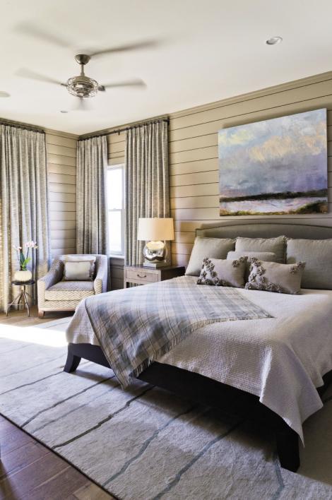
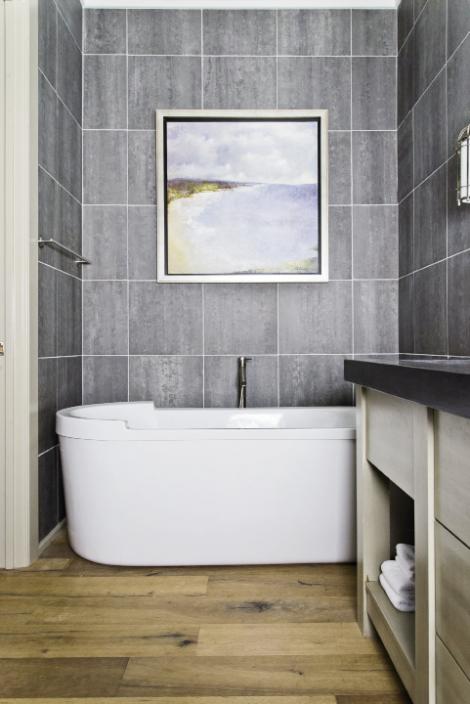
And it explains why, on the second floor, things really mellow out. Those planks go straight and symmetrical, setting a quiet, orderly stage for a pair of master suites. Mossy green linen draperies, custom Tufenkian rugs from Tibet, and walls wrapped in wide plank poplar wood bridge modern and serene. In the adjoining baths, large slate tiles rise floor to ceiling, and chrome fixtures pair with bright white porcelain (most notably in the form of deep spa tubs).
“We continued the wood floors as a way of keeping things natural, ” says Cortney. “And even though the rooms varied in style—one’s a little edgier, one leans transitional—we followed rules of symmetry in these rooms. There’s balance.”
On the top floor, these rules break wide open. “We designed the house around having a single open-air penthouse living space, ” says Cortney. “No separation of rooms or hard-and-fast rules, just a comfortable indoor/outdoor spot where everyone can be together.”
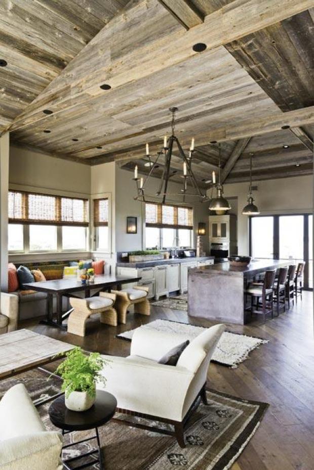
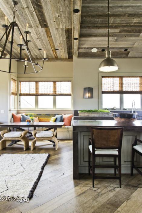
Ocean breezes float right through a simple open kitchen with a concrete island and metal pendant lighting; a living area with cozy, cream-colored seating; and a vibrant banquette in between, built by local artisan Matt Decell. “We chose neutral base fabric and wood finishes in this nook so we can switch those layers out, ” says Cortney.
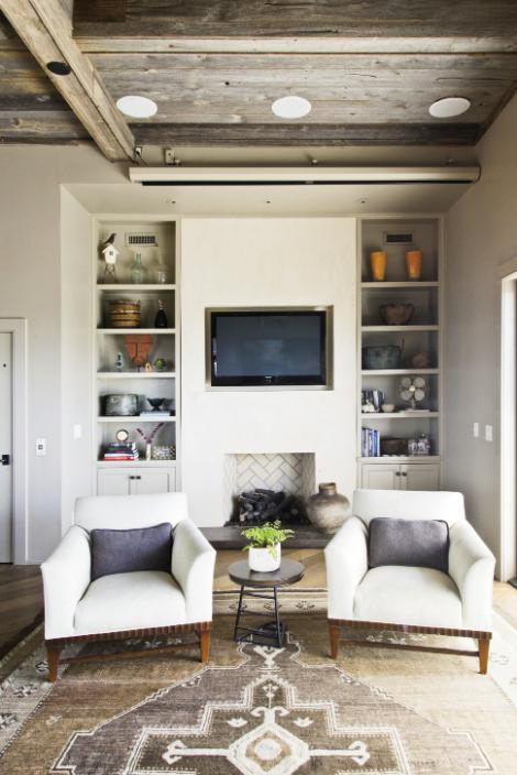
At either end, glass Nano Doors—a window system designed so walls “disappear, ” similar to garage or barn doors—fold up accordian-style. “Up here, you have views of the trees, the skies, and the water, ” she adds. “These are all elements we want to play up.” To that end, a grayed barnwood ceiling highlights the natural landscape, as do the jutes and sandy blues of the room’s palette. And funky details—like the ceiling planks placed at directional odds with the floor, a ladder-access TV loft for the kids above the kitchen, and lively Moroccan-hued pillows on the banquette—keep the mood as easygoing as the island outside.
“We liked the laid-back culture here, and our priority was to carry that through in our house, ” says Brad.
Case in point: the family noticed this was a less restrictive neighborhood for dogs than some of the other beaches, and that was, adds Murr, “the icing on the cake.” He and the kids head down to the sand with the family’s
golden retriever, Reese, and St. Bernard, Cocoa, at whim. Back inside, the same crew bounds up and down the stairs, stretches out, and basks in their little corner of the island.
“There’s a place for everybody here, ” Brad says. “We can relax. We can entertain. We can enjoy where we are.”
Mirror your life. “For most of us, life is delightfully imperfect, “ says Cortney, who designed the ceiling boards to be at odds with the flooring and the kitchen’s raw concrete slabs to contrast the modern clean surface of the Venetian plaster walls. “Follow your disposition, rather than design scheme.“
Choose natural over no-nonsense: “Look for chairs, art, even throw pillow patterns that make sense to you, that speak to you. Don’t match—meld your style to your house.“
Nurture the little things. “Greenery goes such a long way—a quirky tree or fern with a mind of its own. These add life and unpredictability to otherwise static interiors.“
Ellen McGauley is Charleston’s home editor. She scouts digs from Awendaw down to Edisto, reports on market trends, and lives in a single house downtown.
____________________
Sorry, the comment form is closed at this time.


Joann Kandrac
OMG Holly, this place is amazing!! I'm a huge fan of Charleston 🙂
Enjoy your vacation!!
Holly Irwin
What a fabulous beach home! I'm in love with the rustic ceilings and muted furnishings. Also love those paintings. Thanks for sharing.
Holly
Lisa Mende Design
What a fab beach house! Love it! Lucky you!!!
Pingback: Link Lovin' | The English Room
Leslie
WOW!
Pingback: Link Lovin’ | The English Room