Hot off the Press: Charlotte Urban Home Feature
After a week of constant setbacks and design challenges, the black cloud has hopefully past with the wonderful surprise of seeing a client’s home published in Charlotte Urban Home Magazine.
Sadly, it has not yet arrived in my mailbox. I cannot wait to see the beautiful cover.
You can see the print feature HERE or the digital HERE.
I am grateful for this wonderful client and dear friend. We had had years of fun transforming her home to suit the vibrant family.
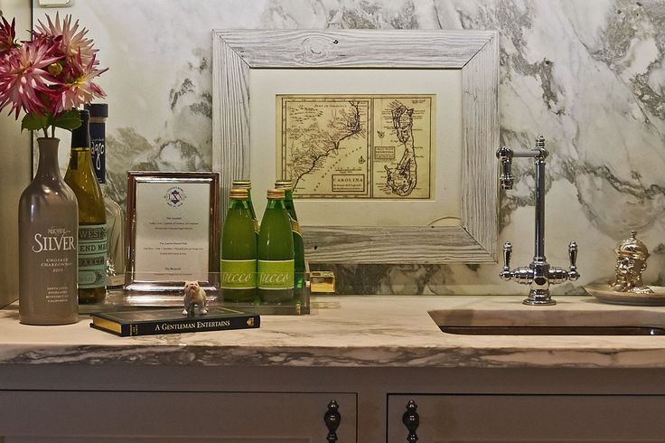
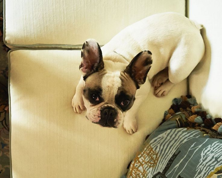
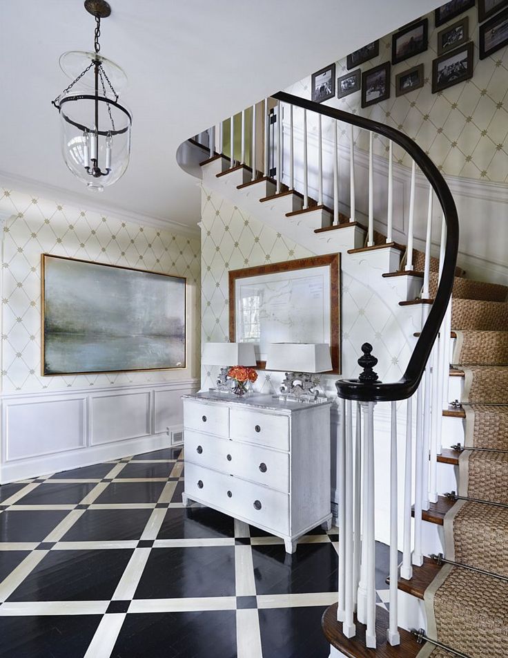
Walking through the Eastover home of Amy and John Hines, you immediately sense the couple’s understated, refined taste: her love of fashion, with preppy New England roots and his interest in maps and history. And even though the couple, their four children and one Frenchie have lived in the home for only 10 years, it has the warm, relaxed feeling of a place that has evolved over time.
Interior Designer Holly Phillips of The English Room may have something to do with that too. She began working with Amy soon after the couple purchased the home. She says the décor works because her client has a passion for decorating and a clear vision for what she likes. The home is also a perfect example of Holly’s design philosophy: “Buy the things you love and you will find a place for them.”
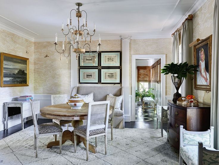
“Holly and I began with a good foundation of wallpaper and paints, ” says Amy. “I still love all of the wallpapers we chose to this day, especially the painted Paul Montgomery paper Holly found for our dining room.”
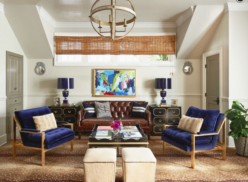
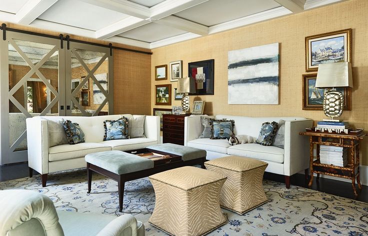
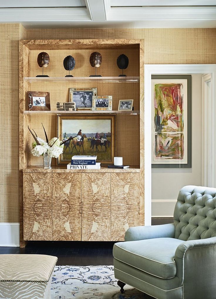
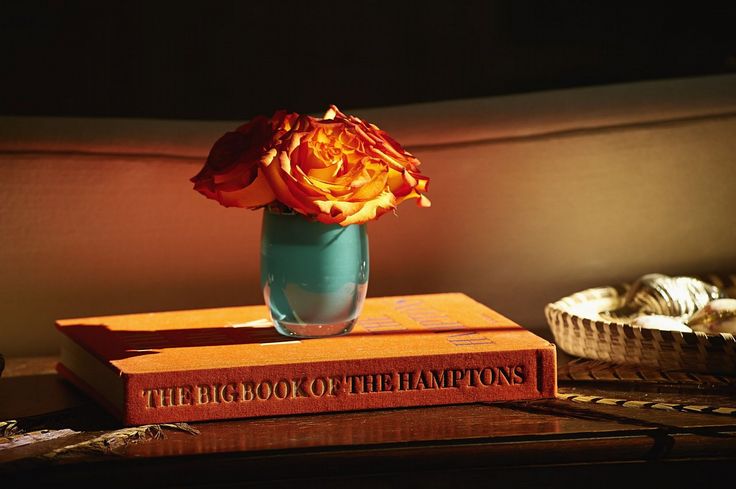
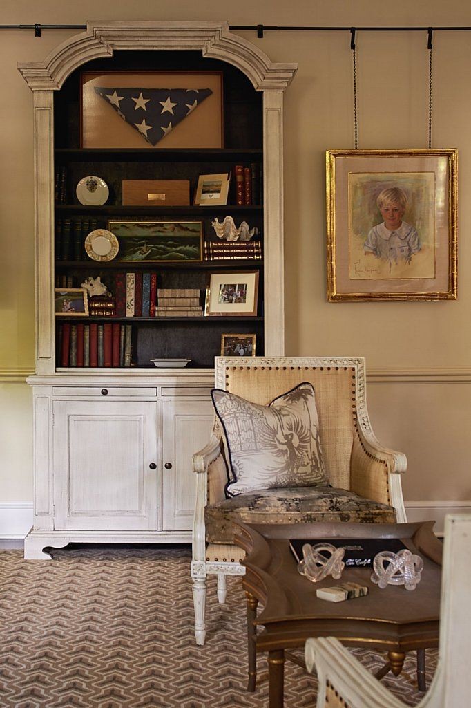
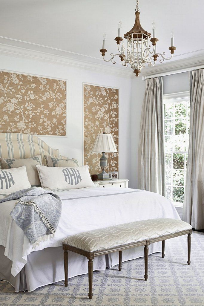
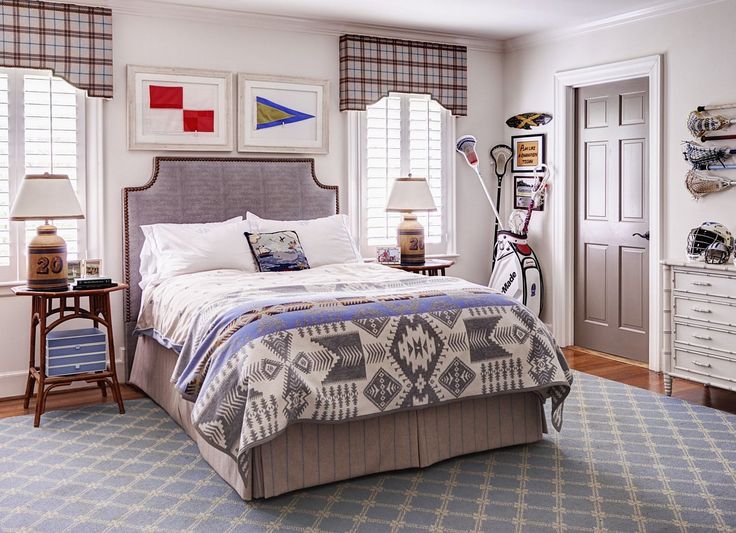
The things Amy loves most about her home are the textures that make it warm and welcoming: grasscloth, seagrass, fur and suede. She also loves the plaids and stripes used as accents and the artwork the couple has collected from their travels and from local artists in Charlotte.
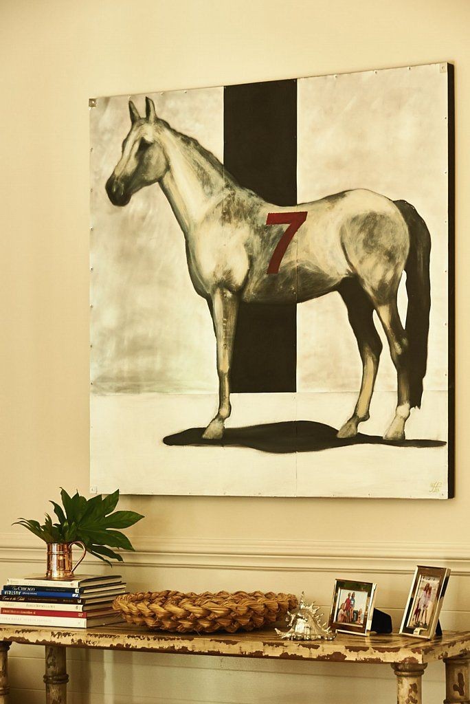
“Some people curate and Amy is one of those, ” explains Holly. “That is why her home is ever-changing and always evolving. It is a product of constant layering and it absolutely speaks to Amy’s personality.” As Amy continues to curate, Holly helps her incorporate each new treasure into the home’s décor. Maps, nautical themes, equestrian items and original artwork are a few of Amy’s favorites that find their way into the design scheme.
“We layer. Nothing is done in a hurry, ” says Holly. “Amy finds a piece of art she loves and we move the décor around in the house to accommodate the new addition. She loves pieces she can move from room to room.” And while the home reflects Amy’s taste, Holly’s influence is seen throughout, as an eclectically modern twist on Amy’s classically understated style.
“My style is more modern. I love mixing antiques with contemporary pieces and modern art, ” says Holly. “I am also always attracted to color, while Amy prefers a more subtle palette of beiges, taupes and grays that remind her of the Nantucket coast where she loves to vacation.”
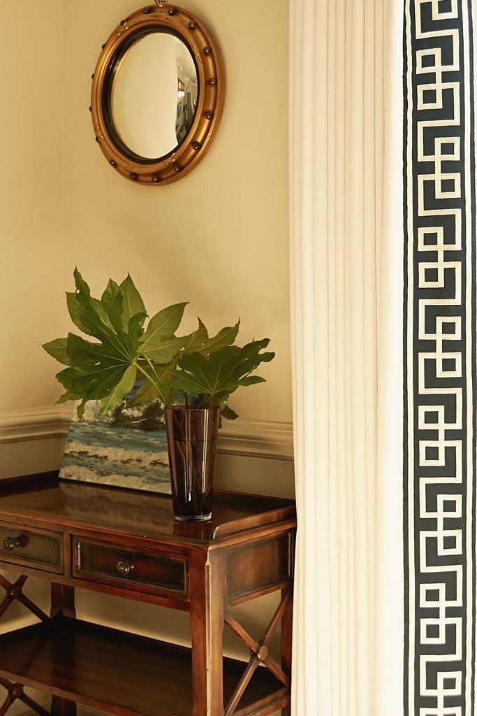
Like the home itself, the working relationship between the two women has evolved. Amy appreciates Holly’s designer eye. “She is able to mix my more calm whites and grays with a pop of something modern like Kathryn Ireland’s Greek key window treatments, turtle lamps or Amanda Talley’s fun artwork.”
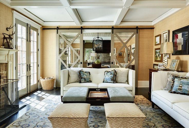
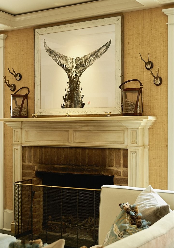
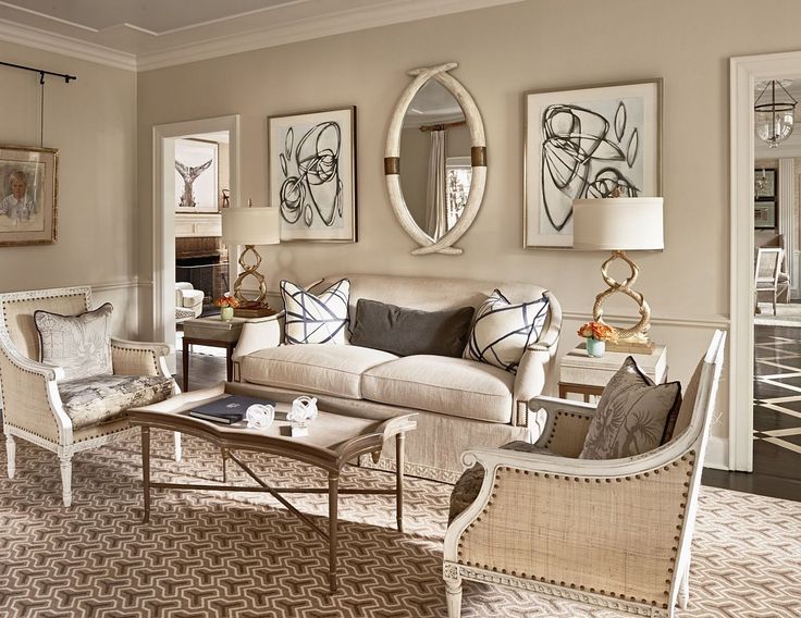
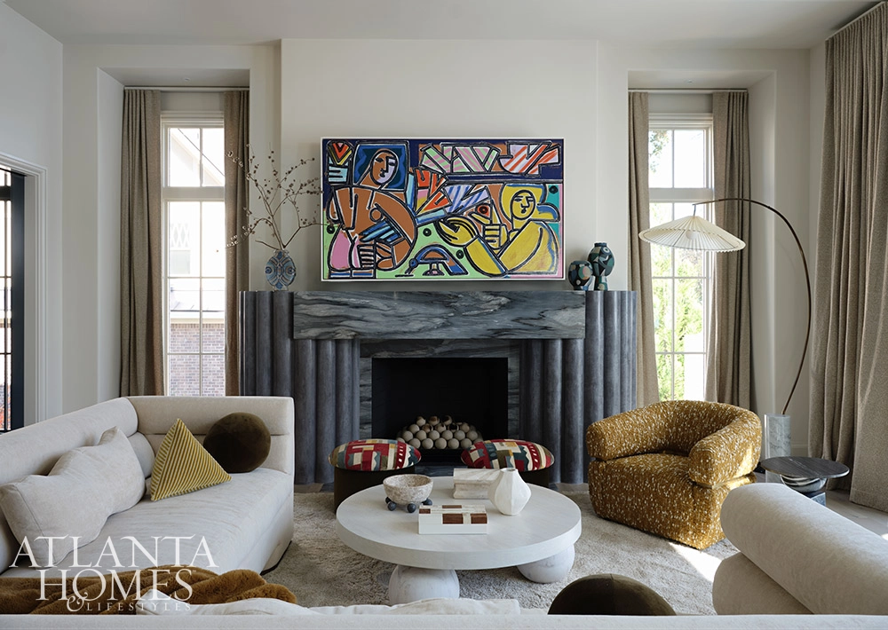
Some of the most interesting design elements in the home speak to the women’s shared love of animals. Golden turtle shells and intertwined coy lamps, crystal snakes on the coffee table, antlers in the kitchen; paintings of birds, thoroughbreds and whale’s tales, animal-hide rugs and antelope patterned carpet (a personal favorite of Holly’s) connect the home with nature. The living room, with its mix of modern and traditional, is Holly’s favorite. She loves the contrast of the horn mirror, modern artwork by Amanda Talley (of Hidell Brooks Gallery) and the David Hicks rugs. But she also thinks the kitchen is amazing.
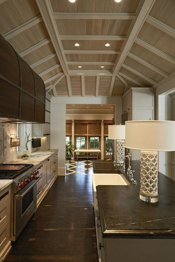
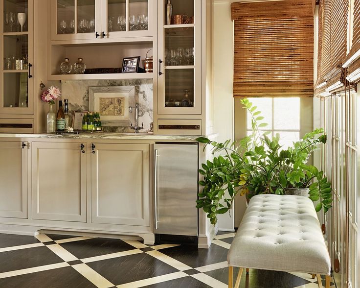
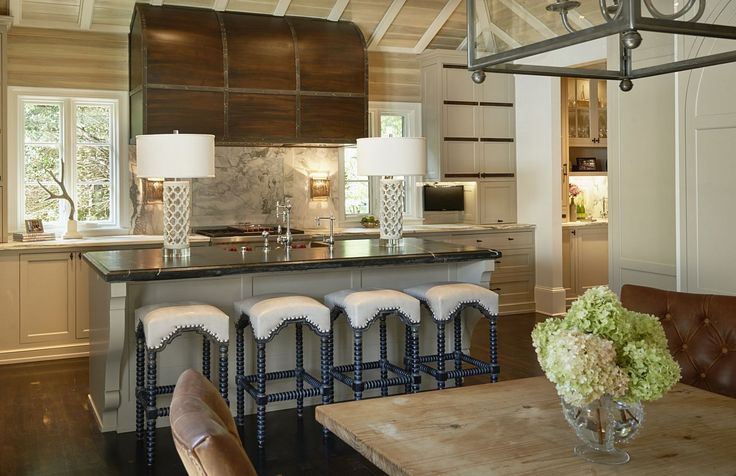
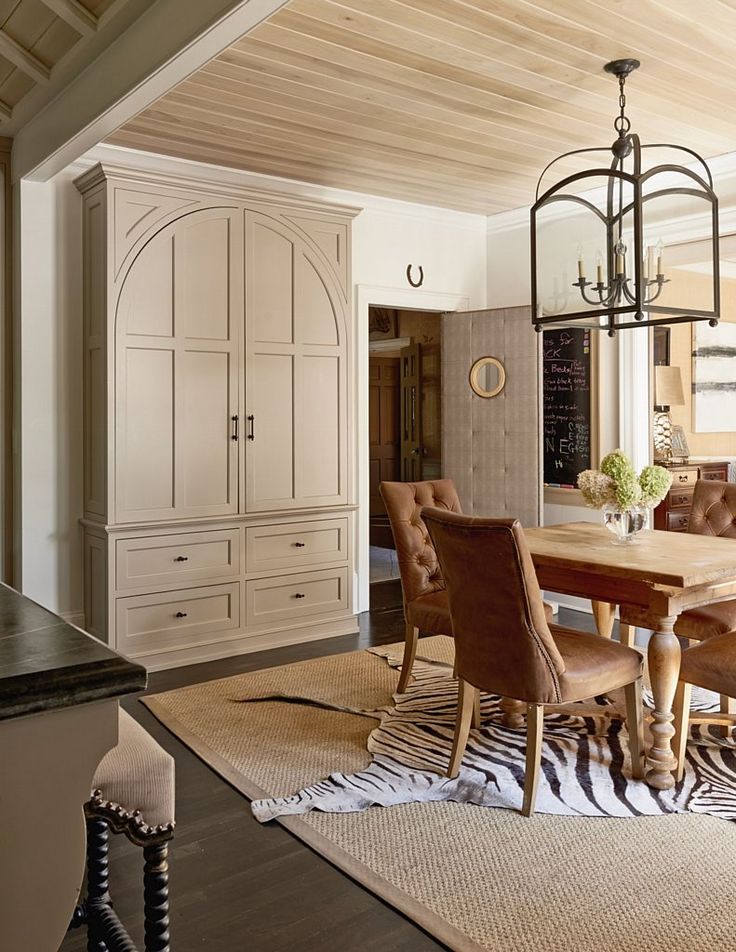
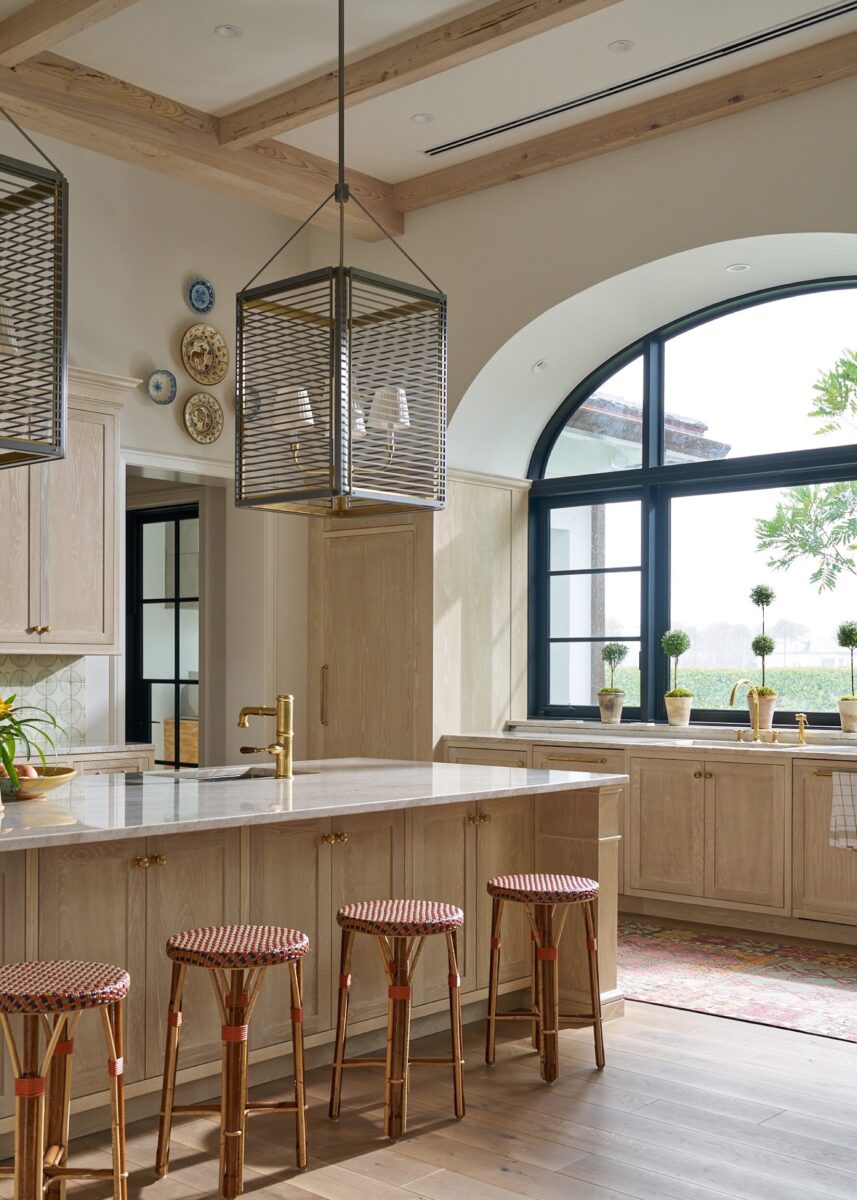
“It is modern and classic all at the same time, which is hard to achieve.” Recently renovated, the Hines’ kitchen was designed by Sam Greason at Meyer Greason Paullin Benson and builder, Andrew Roby. The large island is just big enough to allow people to gather without taking up too much space – perfect for the family that loves to cook together.
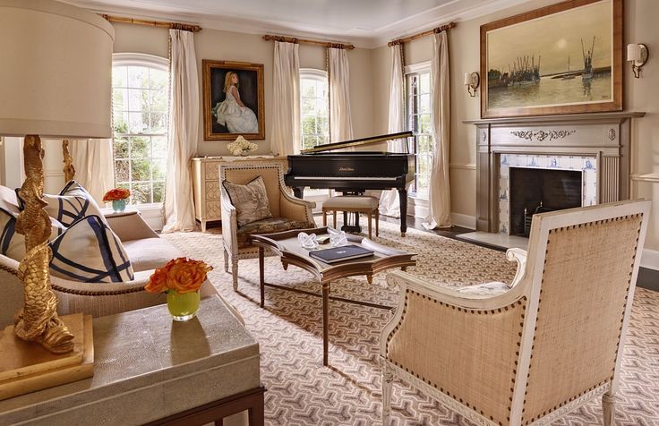
“We added pretty lamps and curved sides to accent the area and make the oven hood a focal point, ” Amy says. “The forged metal work on the cabinets brings in a preppy barn-like feel. We loved the Manhattan Calcutta marble with its dramatic veins.” Even though she loves her new kitchen, Amy says her favorite room is the great room. “It is layered with art and a pretty rug. There is a constant fire in the fireplace and on nice days we can open the French doors onto the terrace, ” she says. “You can see the kitchen from the great room so it feels like you are in one big room. It’s like getting two beautiful spaces in one.”
Be sure to subscribe to THE ENGLISH ROOM for extra news, giveaways and discounts.
Let’s get friendly on Facebook, Twitter, Pinterest, Tumblr and Instagram.
Please feel free to contact The English Room if you are interested in our interior design services in Charlotte or beyond.
Sorry, the comment form is closed at this time.



Lisa Mende Design
Holly, this is beautiful work! Well done! Esp. Love, love the cabinetry and the barn doors! It’s all fabulous!
Marcio
Great work. Really beautiful.
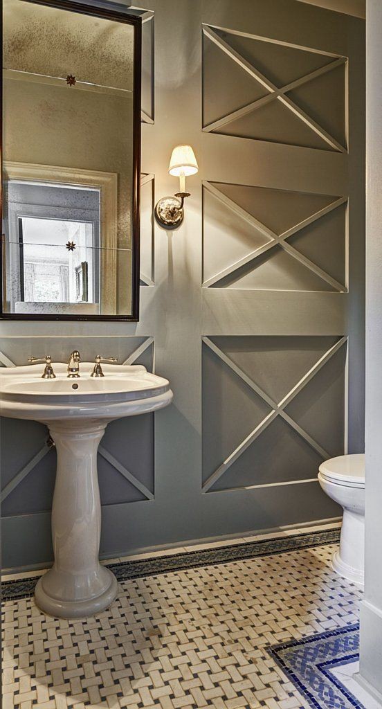
How did you do the molding in the bathroom?