Hot off the Press: Charlotte Urban Home Feature
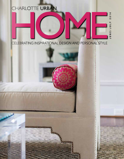
Hot off the press is a client’s home in the current issue of Charlotte Urban Home.
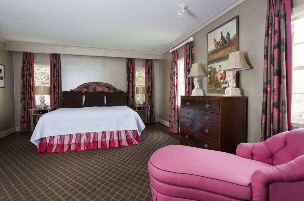
It was such a fun project with the client and I sharing a love of color.
Article By Anne Marie Ashley
Photography by Jim Schmid
However, after seeing the huge yard and inviting floor plan of this home on Sherwood, they knew they’d found their perfect space and could move in without lifting a floorboard. The previous owners had spent two years working with Marilyn “Pete” Mangum of M Pete Inc., alongside architect Garrett Nelson, perfecting the total renovation of the home, and to the luck of Rick and Elizabeth, it was idyllic for their family of six.
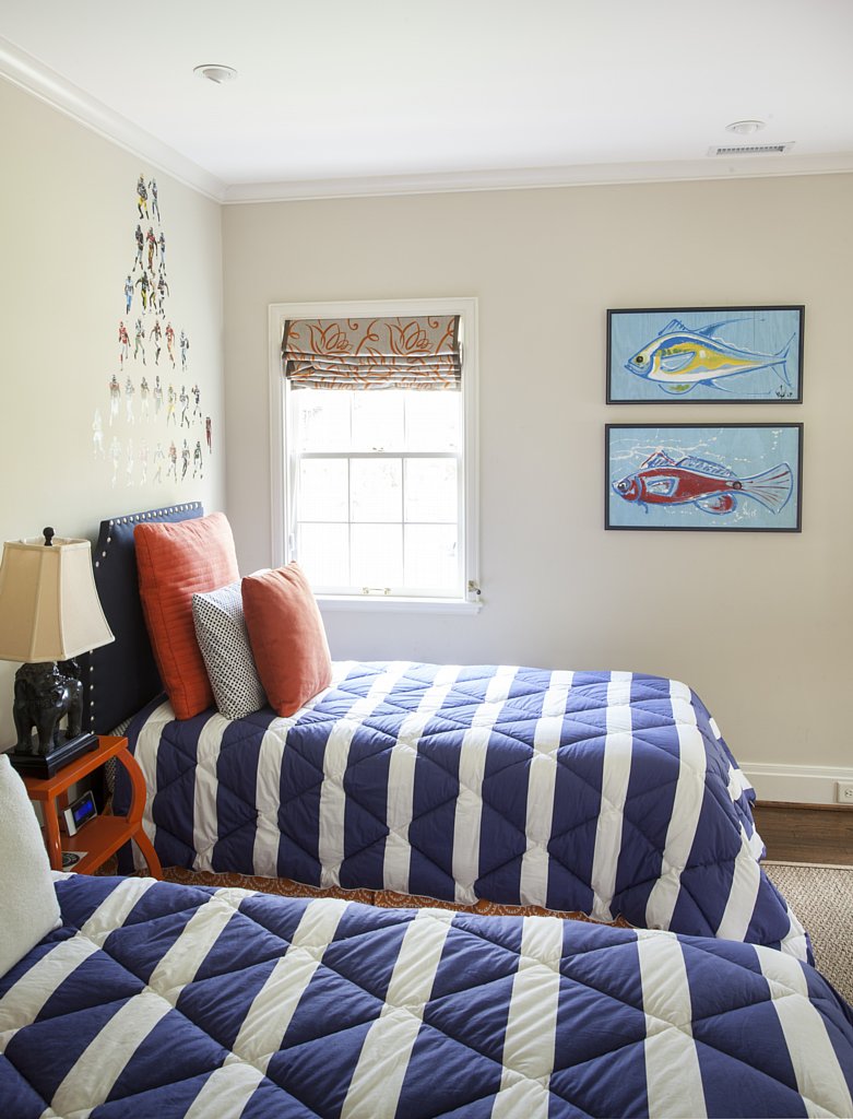
Having lived just two blocks away in their previous home, the Newtons knew how charming Myers Park was, so choosing to stay within the neighborhood was a no-brainer. “We just love the sidewalks and neighborhood feel of Sherwood Avenue, ” explains Elizabeth, “plus with so many children on the same street, my kids can run from yard to yard, or ride their bikes around safely.” Having worked with Holly Phillips of The English Room in Charlotte on two of her other homes, Elizabeth called on her once more to bring this project together. “Holly is very creative and loves color as much as I do, ” says Elizabeth. “With four young, active children and a dog, we wanted something elegant, yet totally practical and she helped me bring it all together beautifully.” Holly adds, “Elizabeth and I share a love of color. We often gravitate to the same textiles and art. I think this project is a wonderful reflection of our joint vision for a vibrant home that has refined style, yet still embraces the family full of young children that live there.”
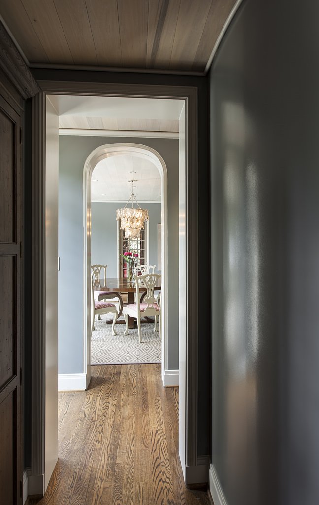
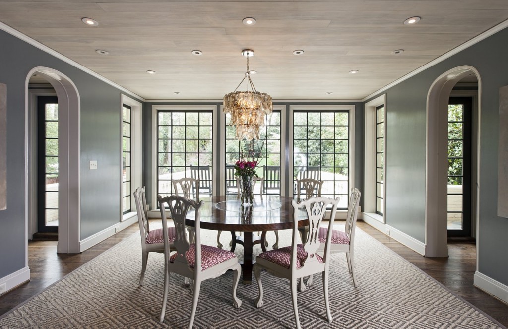
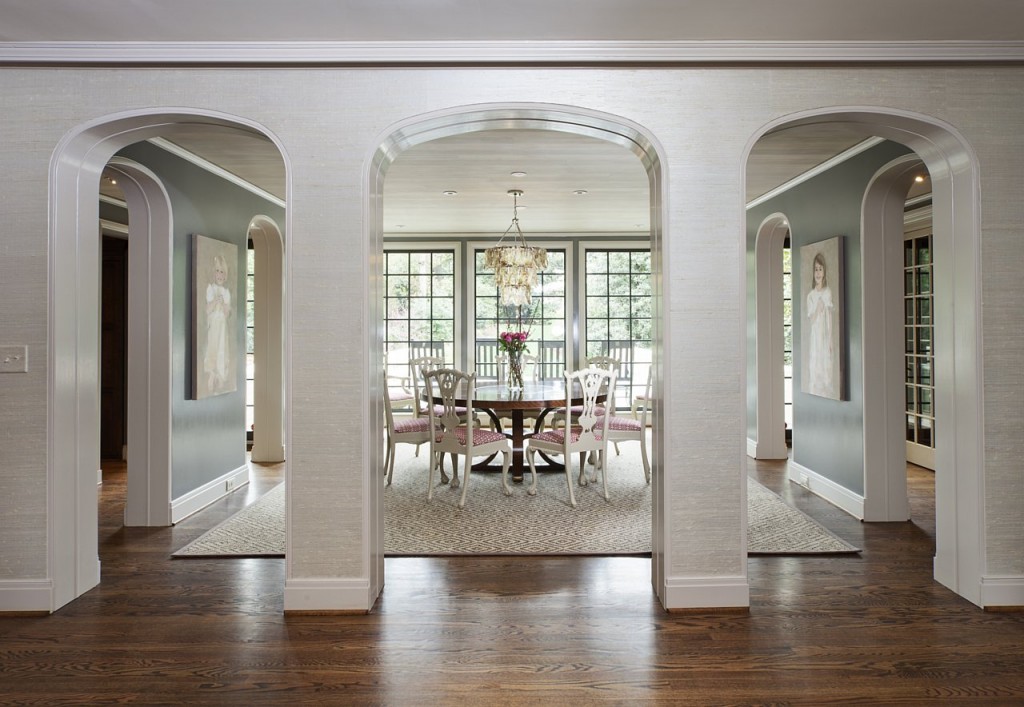
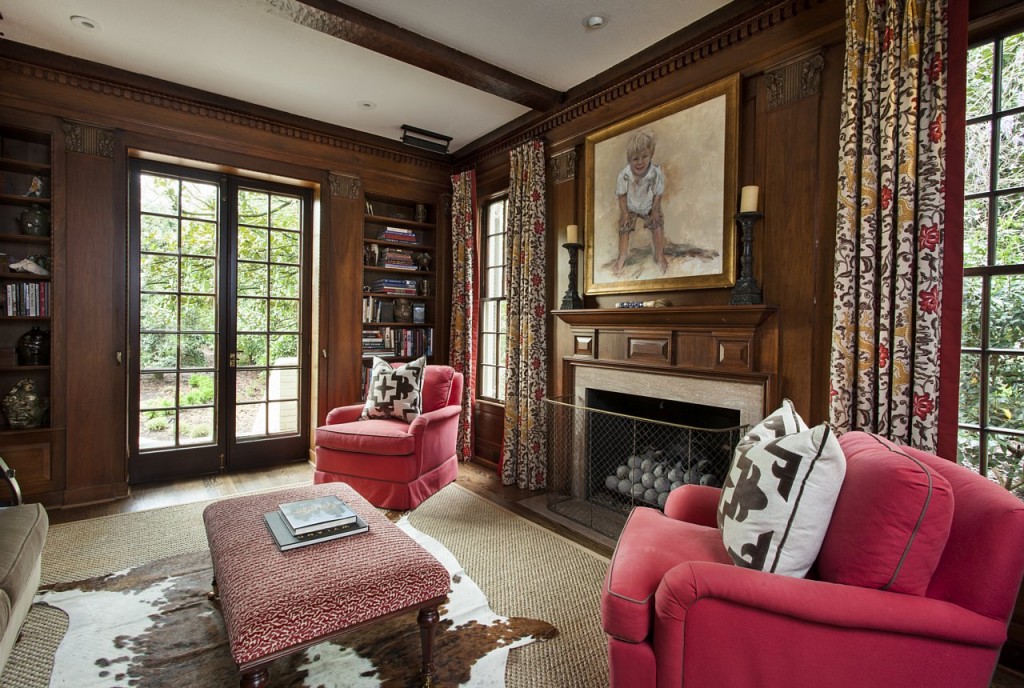
Making the home an inviting place to entertain and host friends and family were also top priorities for the couple, so choosing the right seating and living space arrangements were paramount. “A home is how you choose to live in it, ” adds Elizabeth. The team opted to switch the dining room into a den, and the den into the dining room, for example.
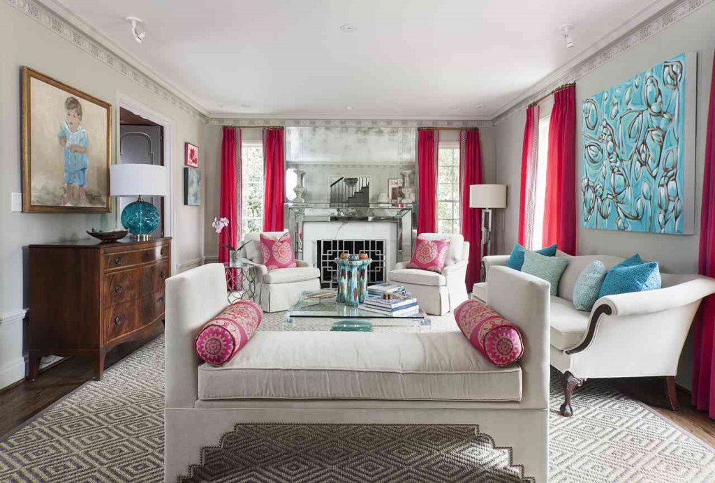
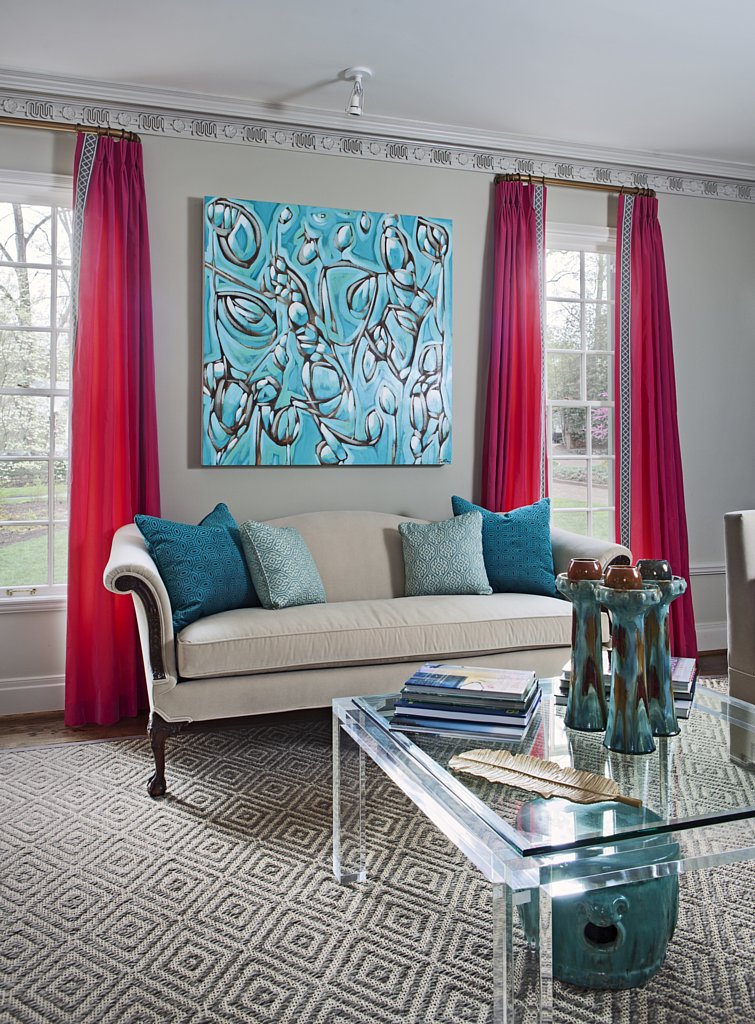
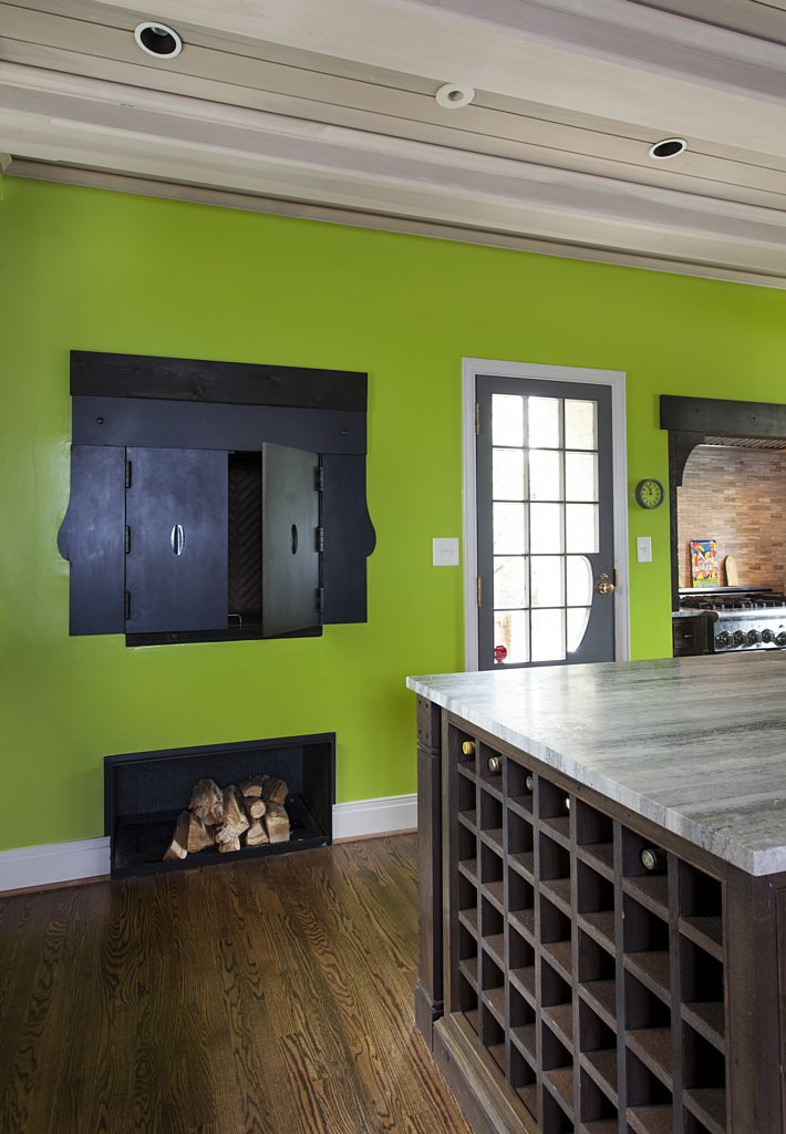
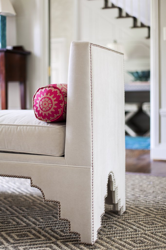
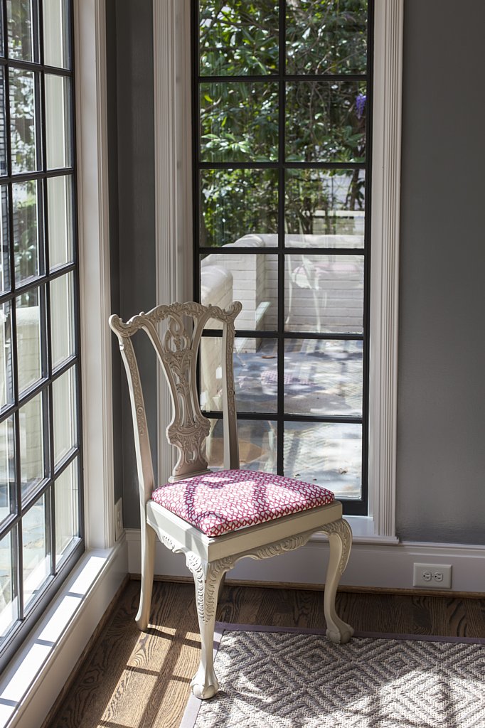
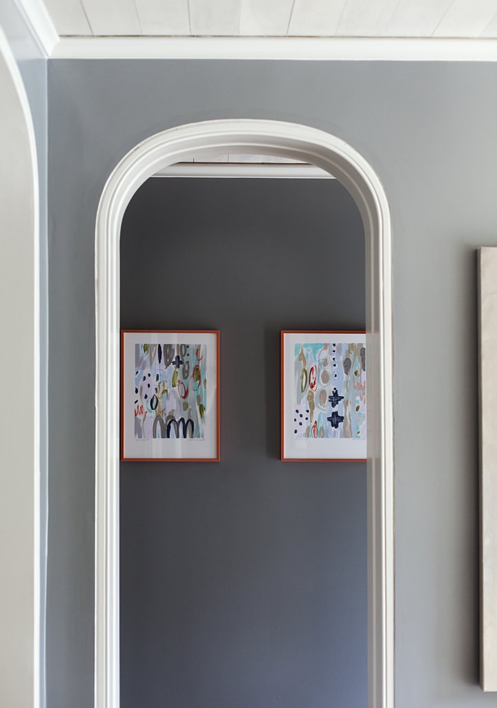
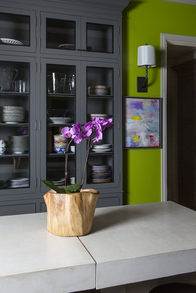
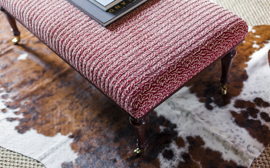
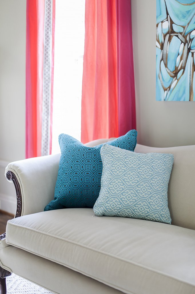
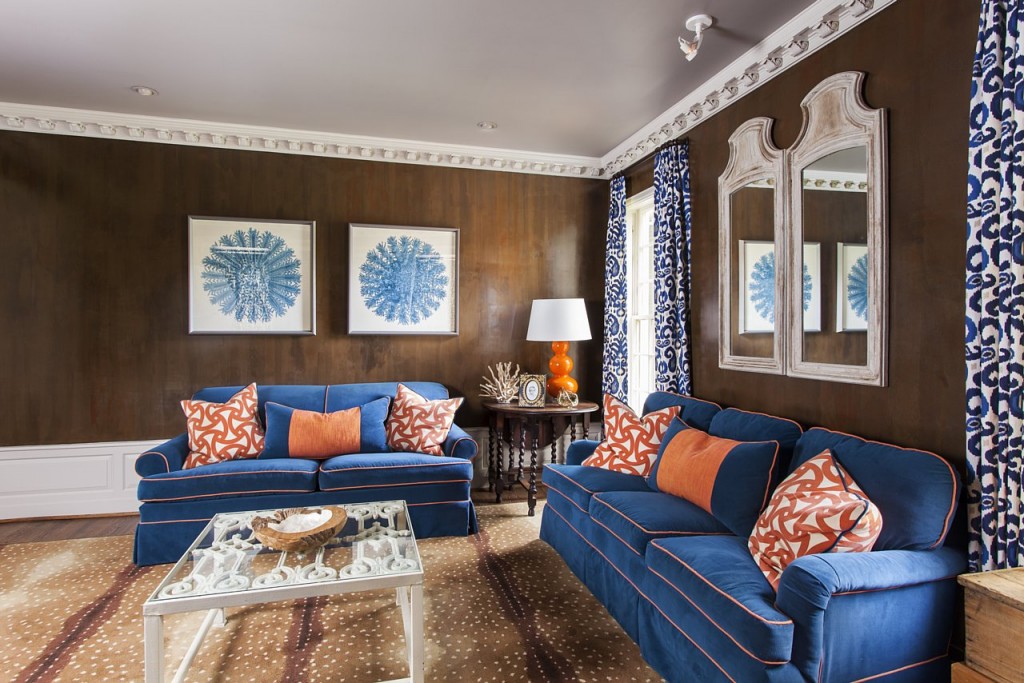
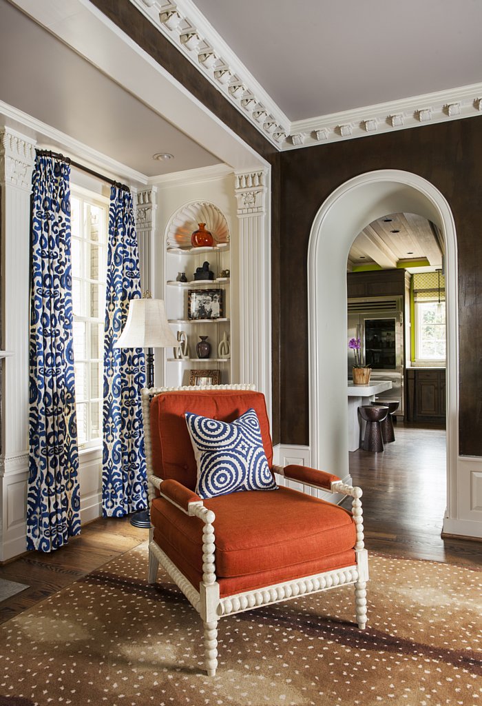
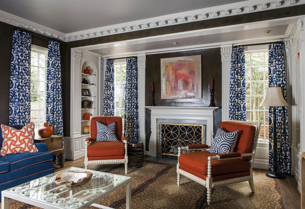
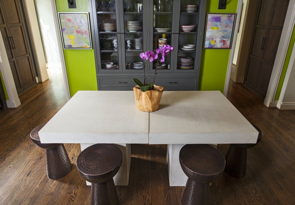
“I didn’t want to walk in my front door and see my family lounging in the living room as the first thing. It just made more sense for our family.” The Newtons began collecting art pieces from different artists around Charlotte and discovered just how complete it can make the rooms in your home. With the help of Holly and Hidell Brooks Gallery, Elizabeth found pieces that fit perfectly into the spaces that needed a little something extra. Her children’s portraits, done by local artist Jackie Roche, are placed alongside several other local artists’ paintings and her face jug pottery collection from potters around the south can be found here and there throughout the home. “I like to mix old with new, ” Elizabeth explains. The love of color can be seen throughout the home as well, with a spring-green kitchen, complete with a wood burning brick oven, a classic combination of bold blue and vibrant orange popin the keeping room and bright hot pink and turquoise are toned with calming neutrals in the living room at the front of the home. “My interiors are often punctuated by the use of bold colors, abstract art mixed with antiques and vintage pieces, ” explains Holly. “It is these layers combined with personal objects that make the house a home.”
Drawing pieces from favorite spots around Charlotte, like Slate Interiors, Darnell & Co. and Cotswold Market place, including custom pieces from Holly’s workroom, the pair quickly finished the total look.
The design took just three short months to complete, an unusual feat according to Holly. “Elizabeth is one of the best decision-makers I’ve ever worked with, ” she explains. “She knows what she likes and is confident in her choices.”
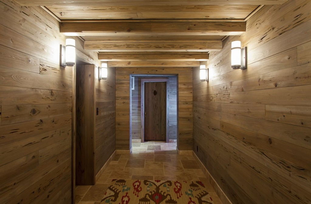
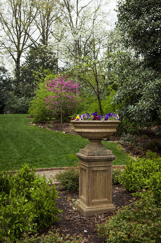
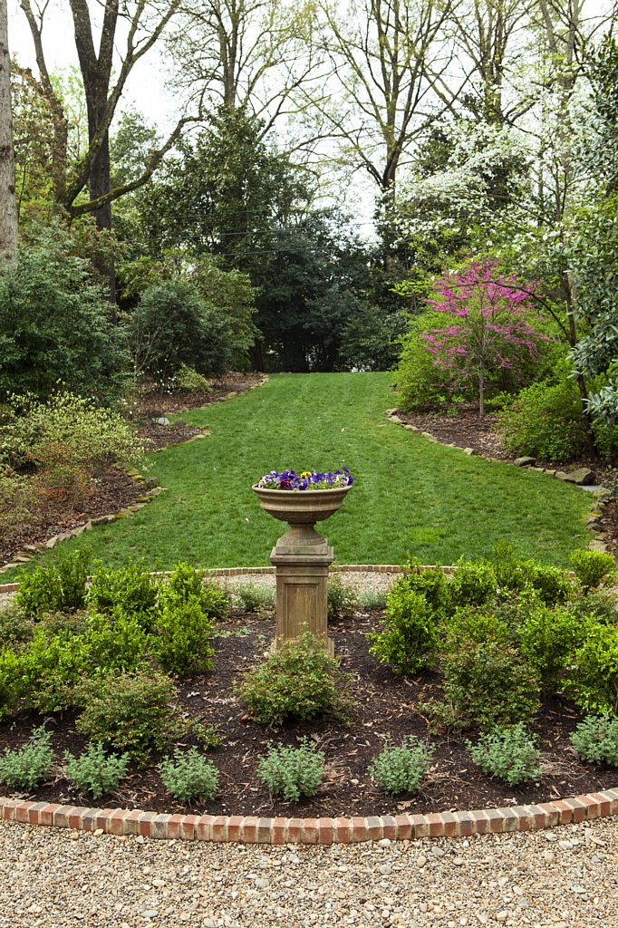
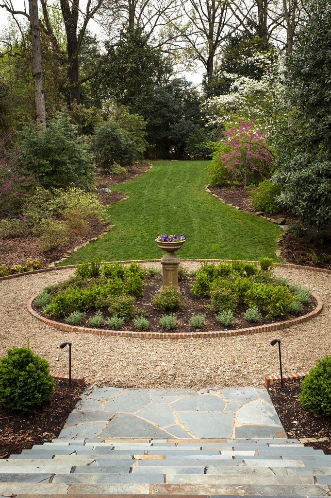
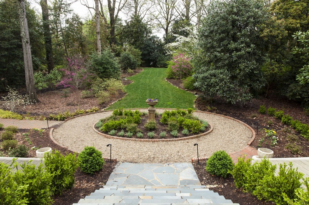
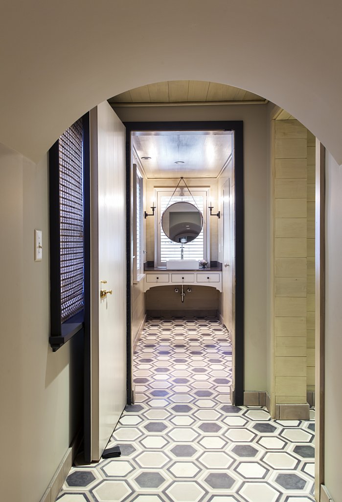
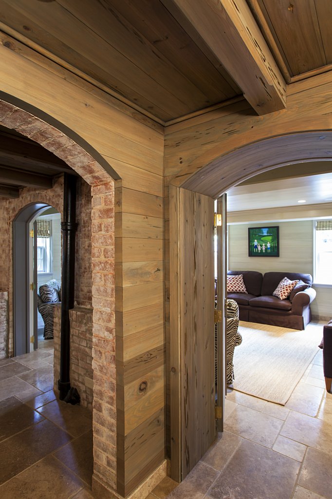
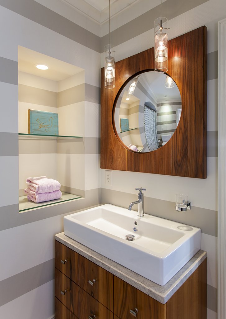
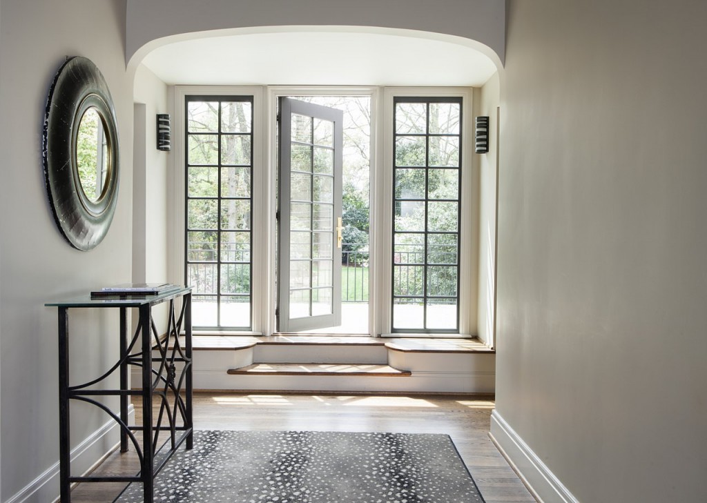
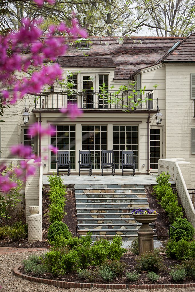
The finished basement offers a respite from weekly activities, with a separate living room and bathroom, and even a “man-cave” for Rick. An all-brick wine cellar doubles as a game room and the long hallways that branch off of the rooms are paneled in wood with a more modern feel. The sprawling backyard can be seen from the front of the house through soaring windows and a terrace on the main level is done in hand-laid stone, while the balcony off of the hallway upstairs offers a birds-eye view of the wooded backyard all-year-round.
When asked what her favorite room in the home is, Elizabeth quickly answers the living room. “Hot pink and turquoise are two of my favorite colors, “ says Elizabeth. “But the room is simple, and with the sunlight that comes in, I feel like it’s a great room in which to decompress from the day. It’s easily one of my favorite rooms in the home.”
You can see the PDF HERE or the online version of the whole magazine HERE.
Enjoy!
Sorry, the comment form is closed at this time.





Whitley Hamlin
Wow holly the home is amazing. Congratulations to you and the family! Their yard is spectacular. Such a gift.