Decorex Find: PaperBoy
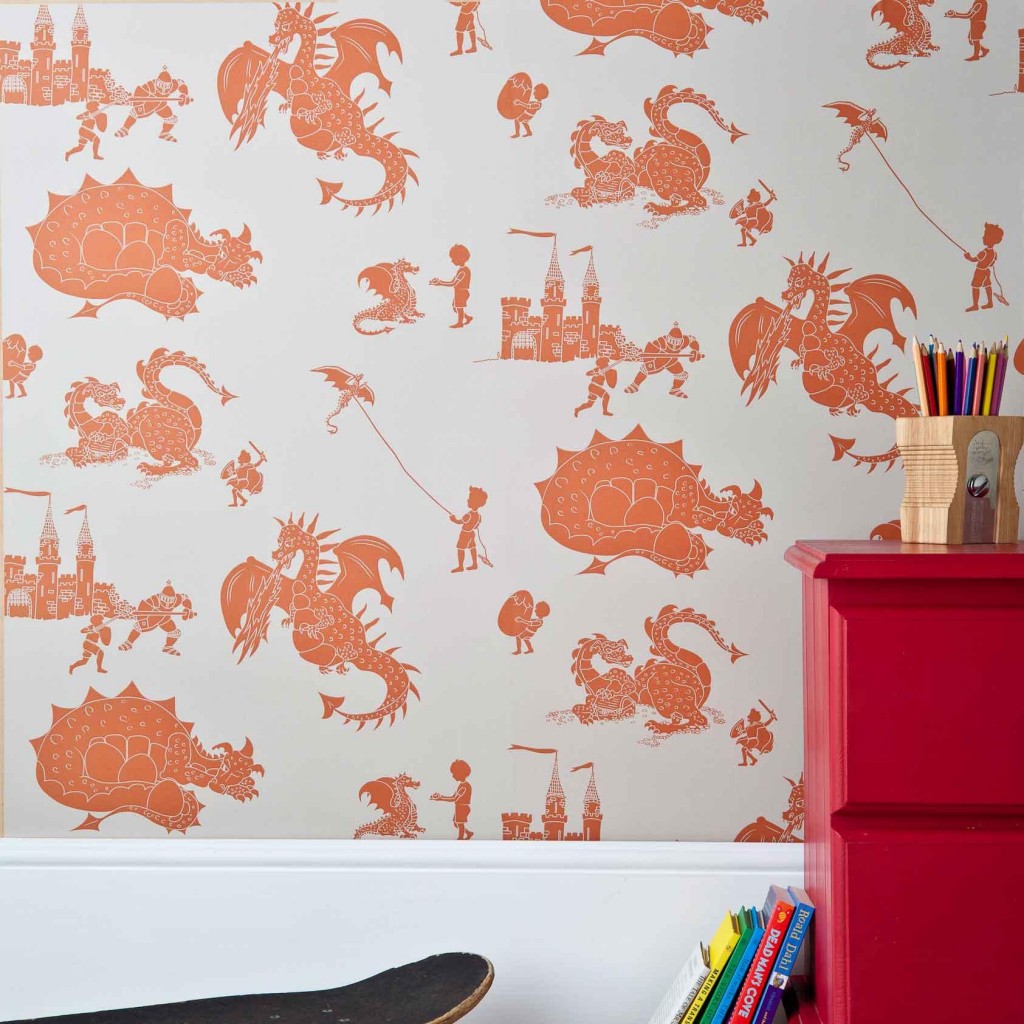
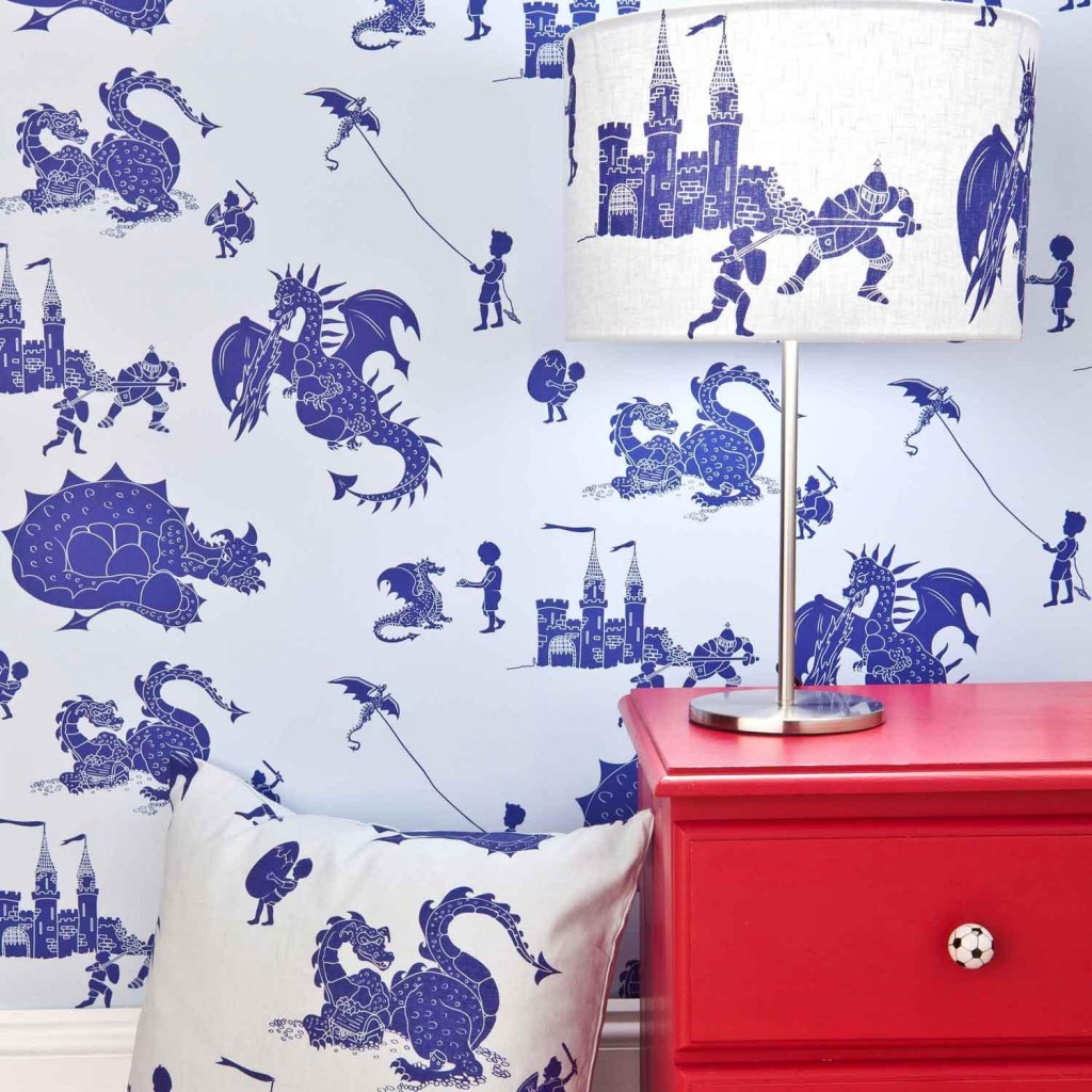
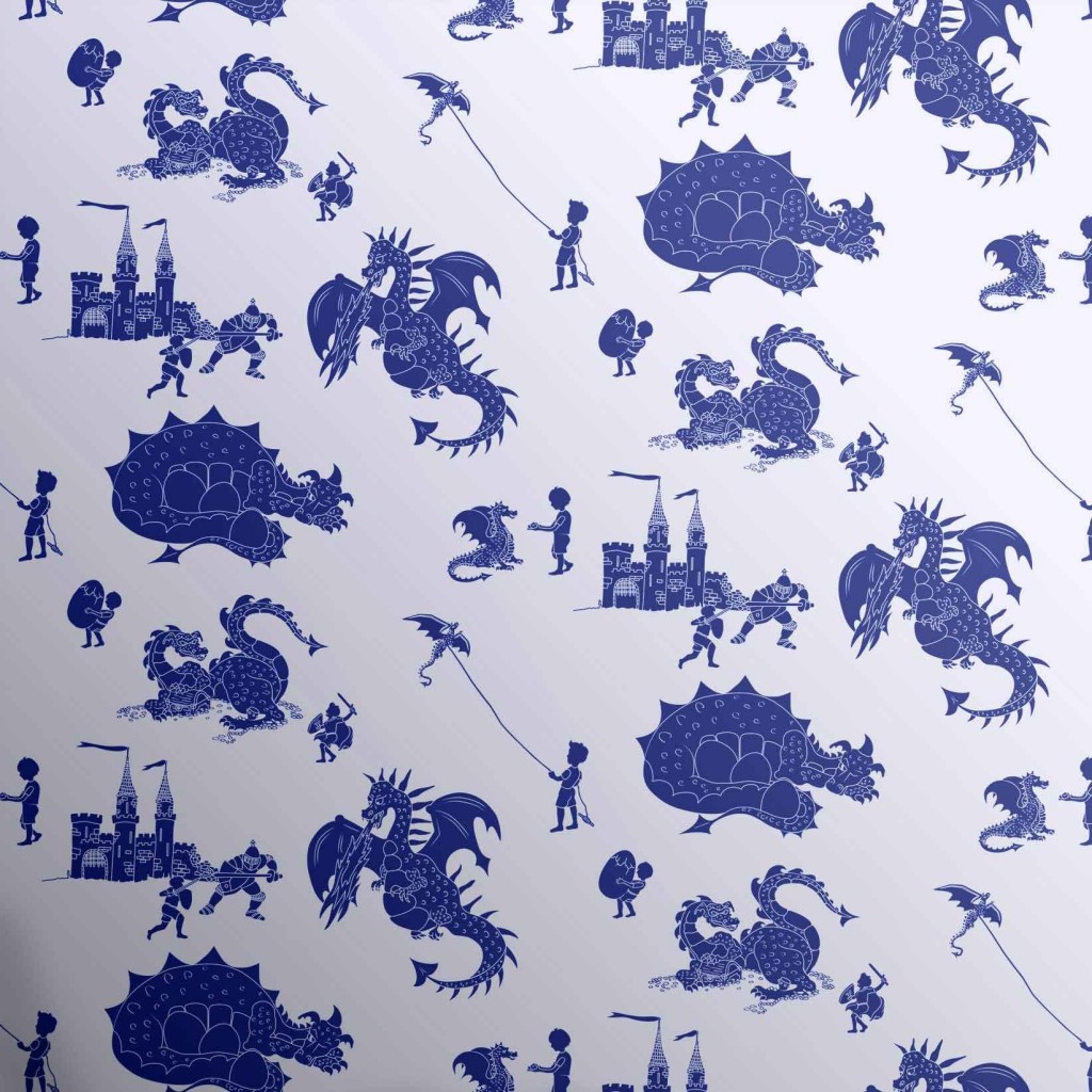
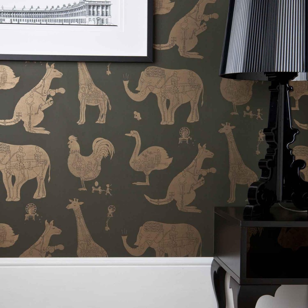
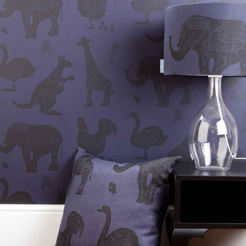
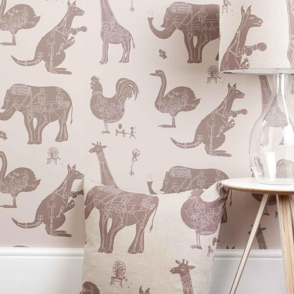
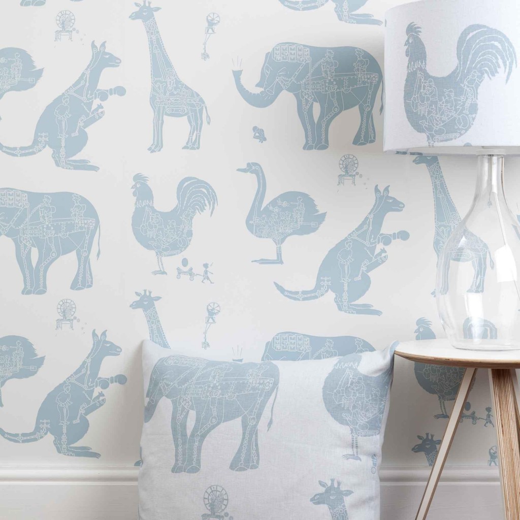
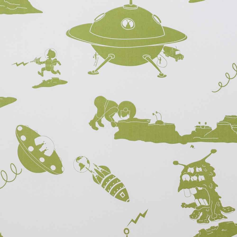
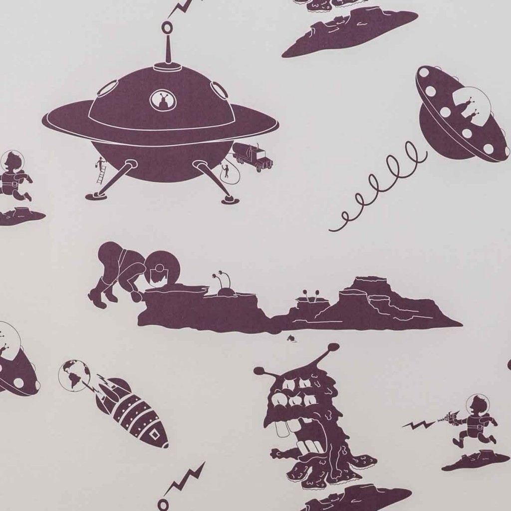
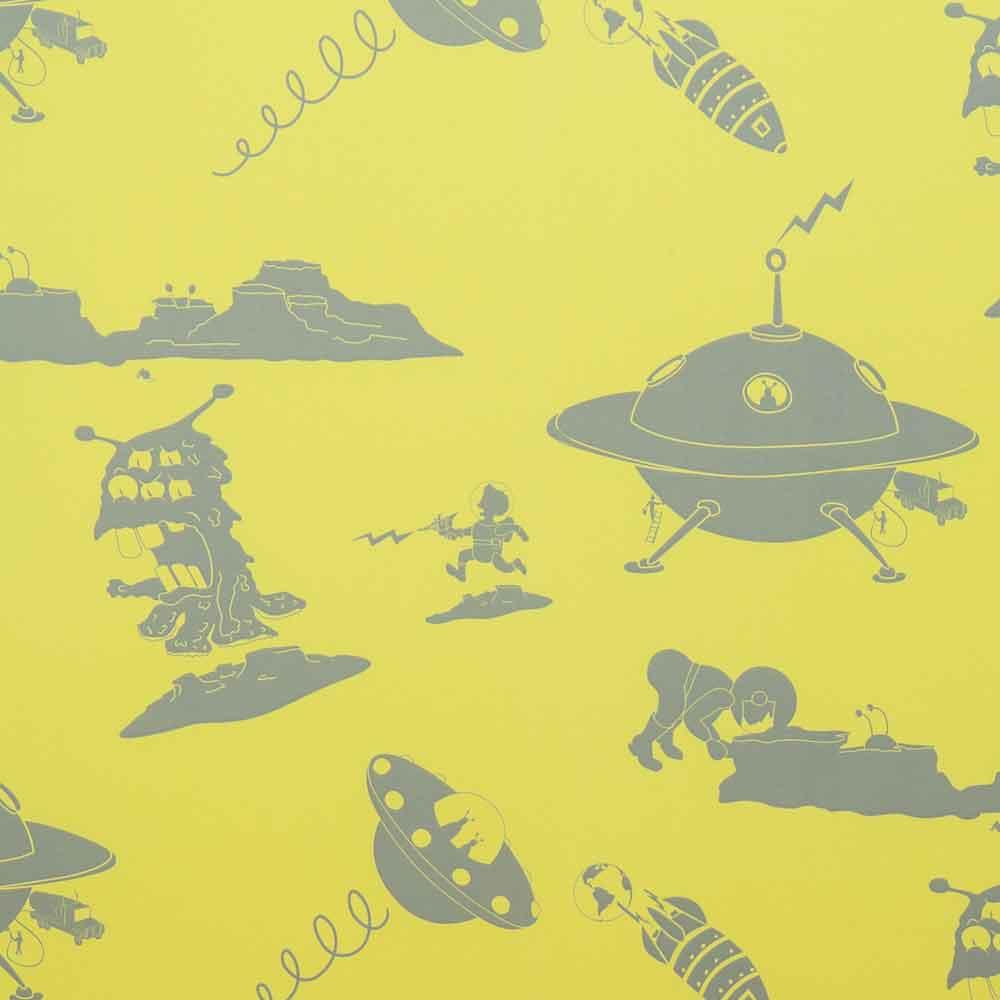
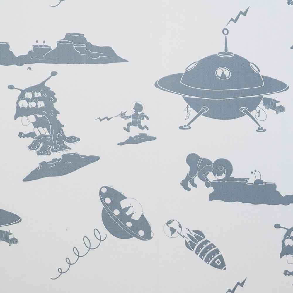
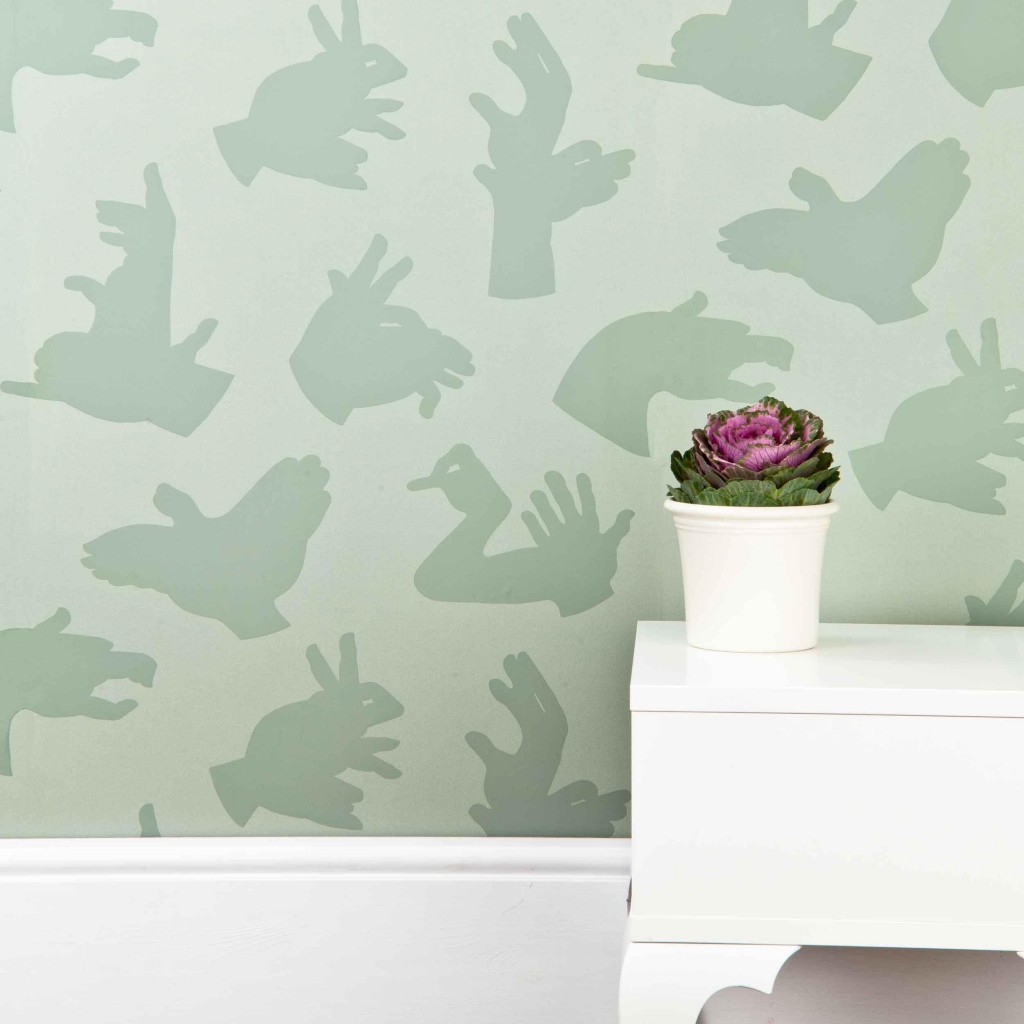
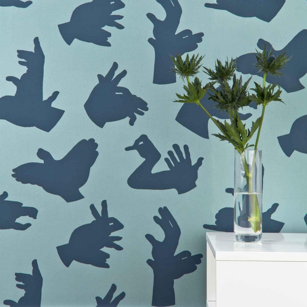
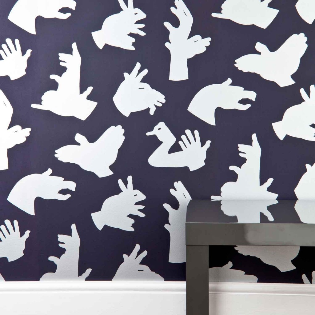
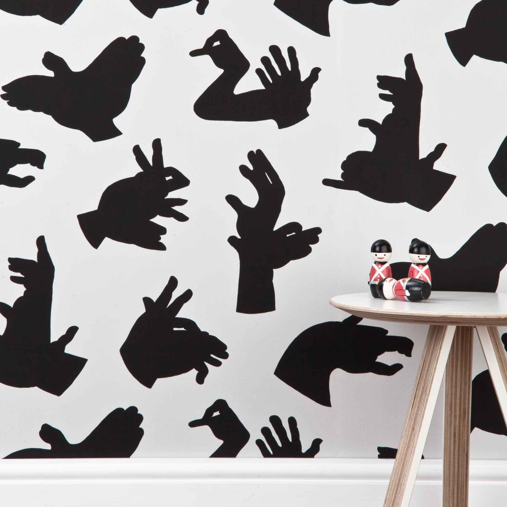
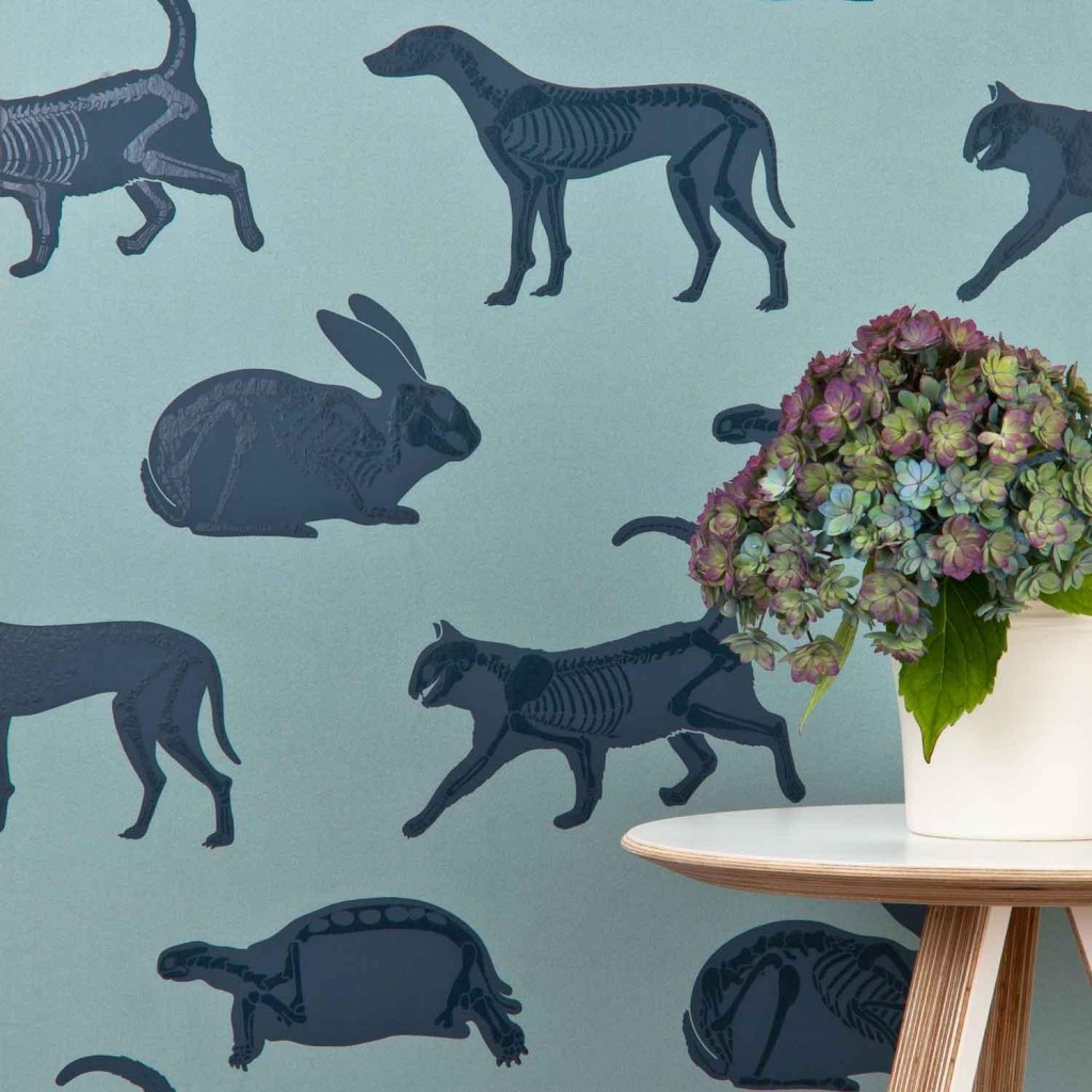
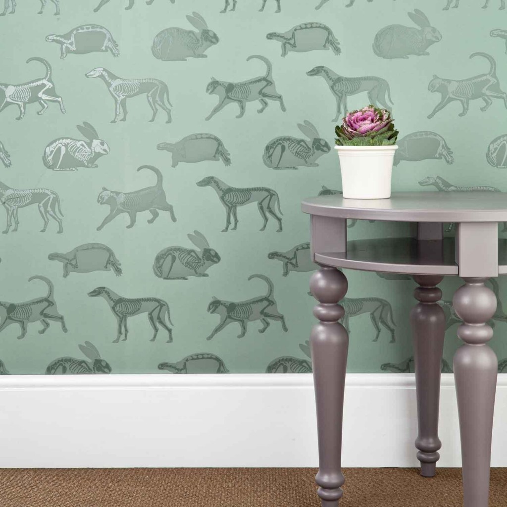
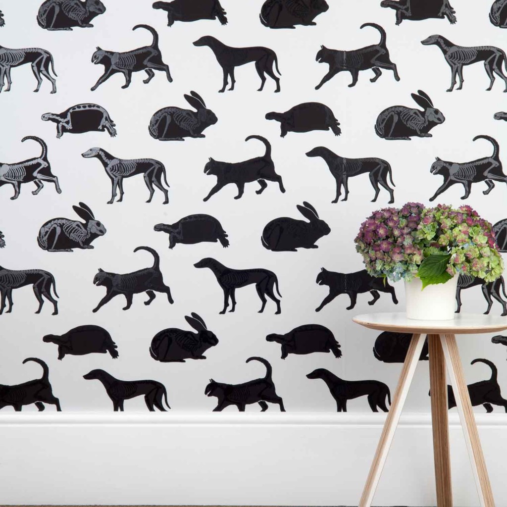
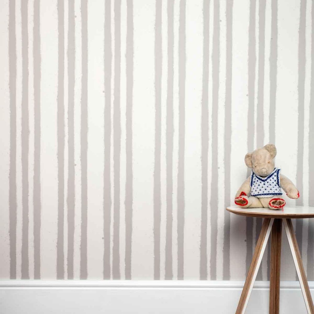
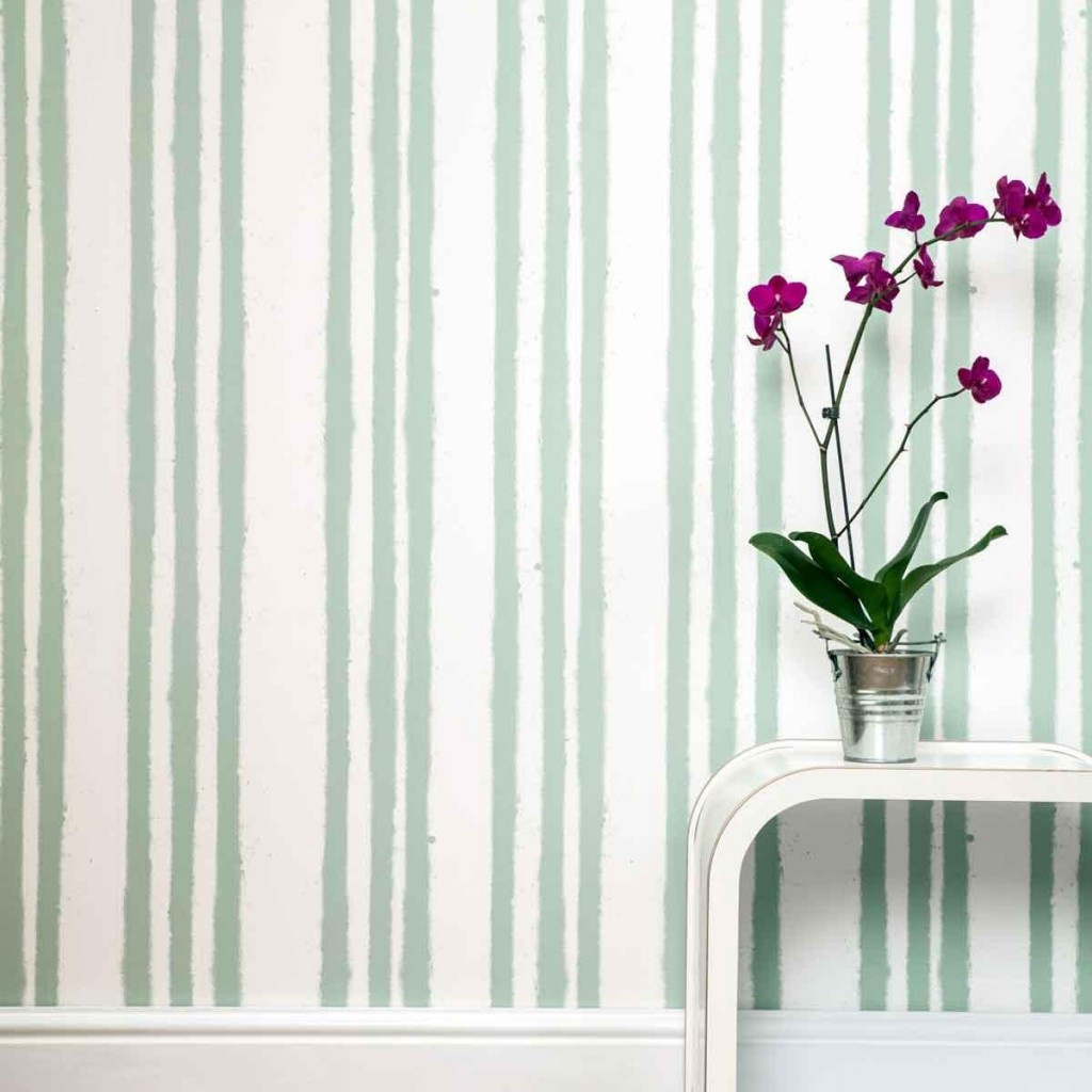
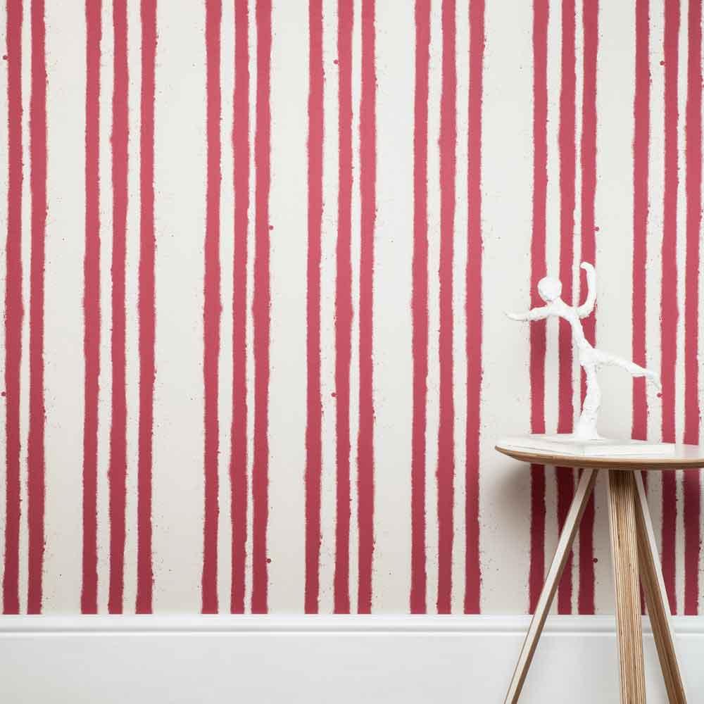
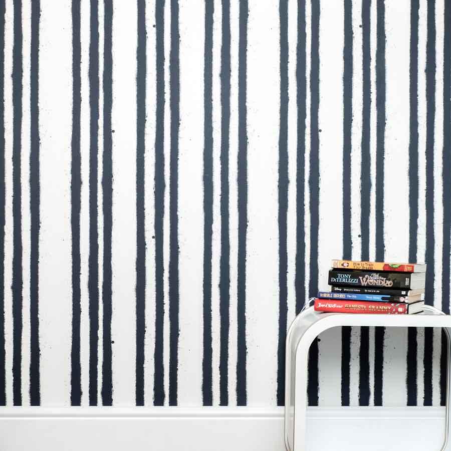
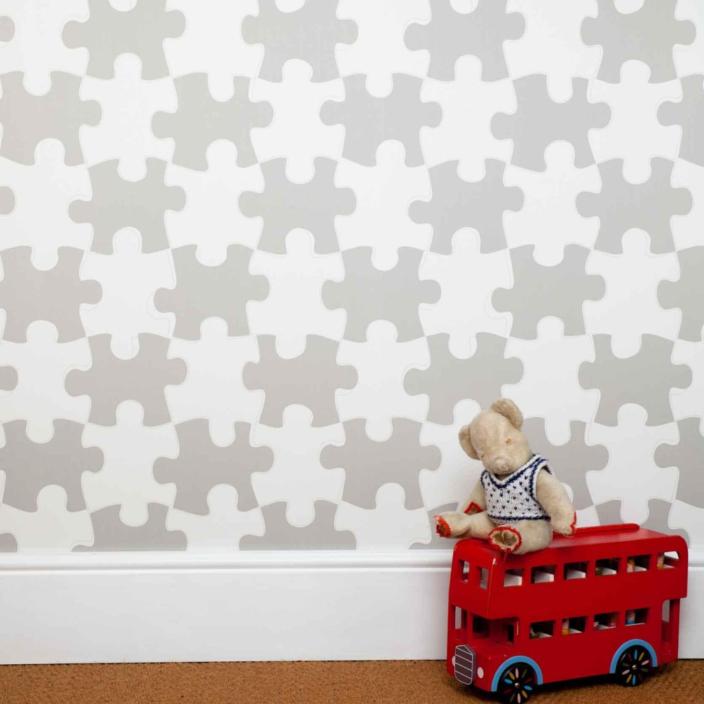
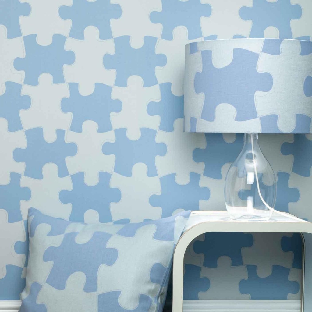
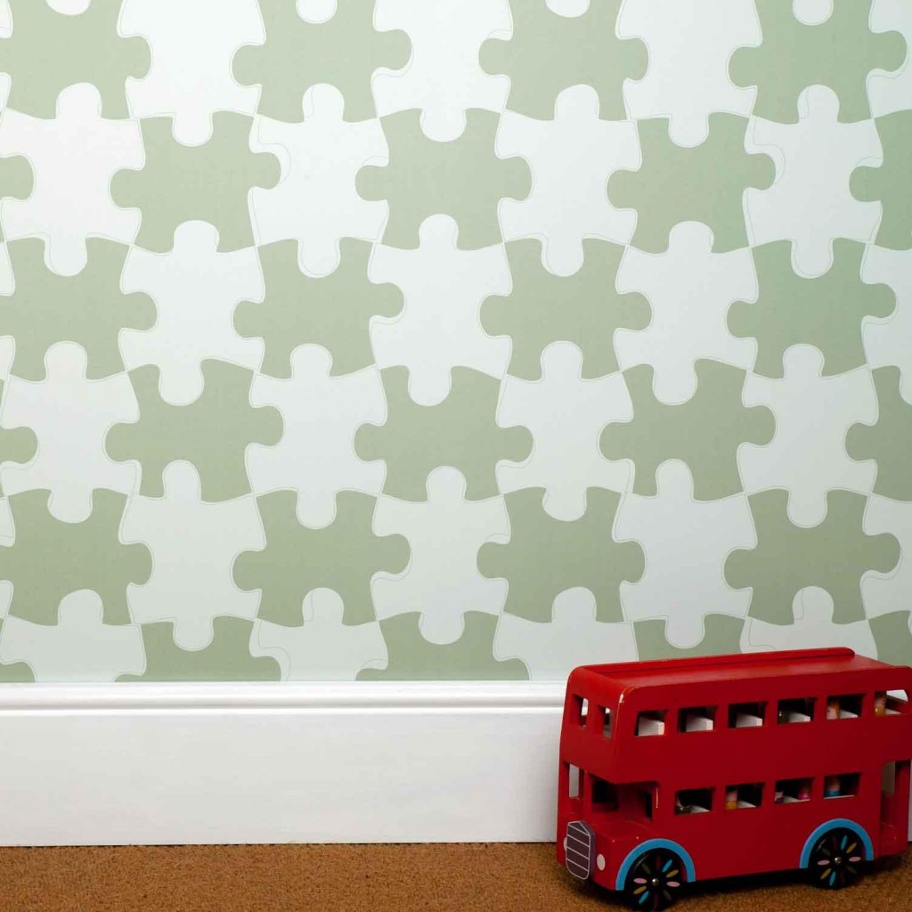
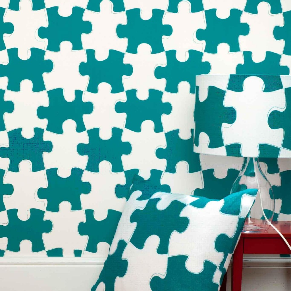
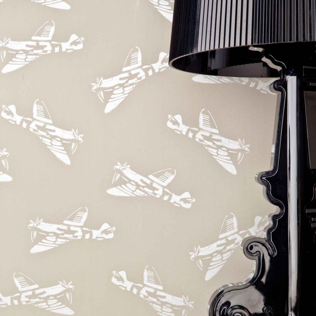
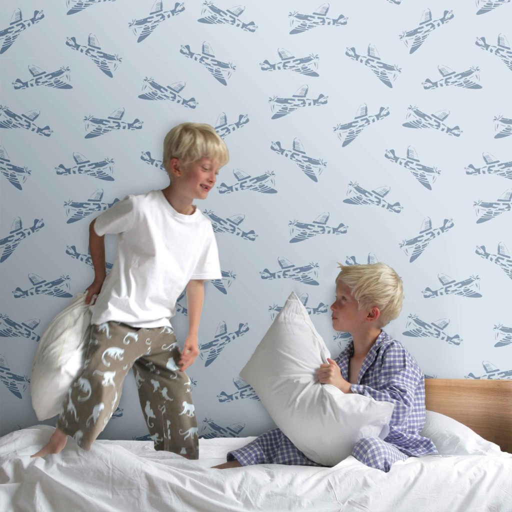
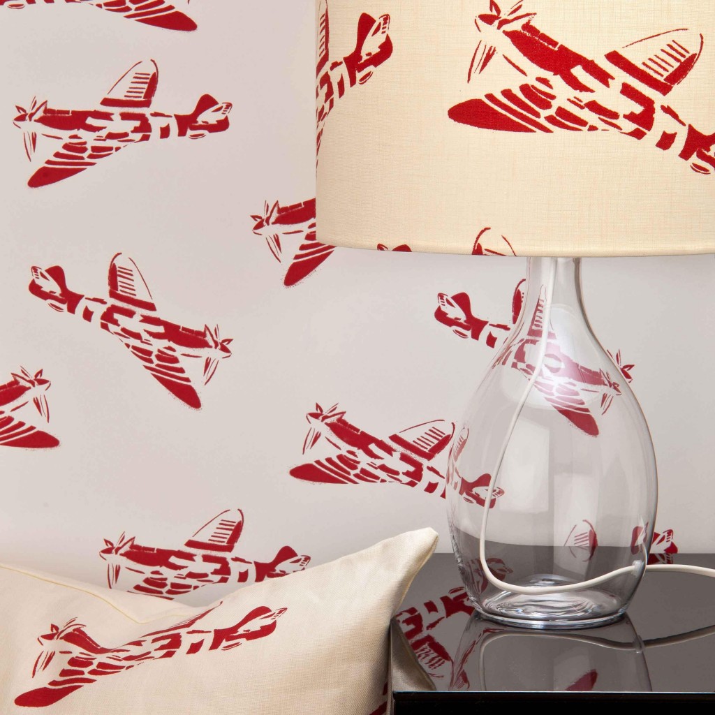
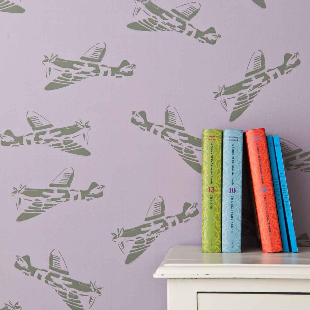
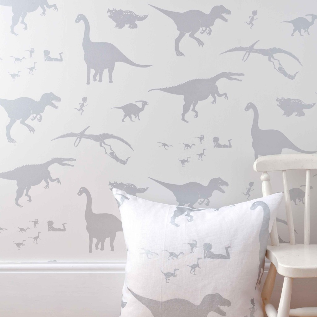
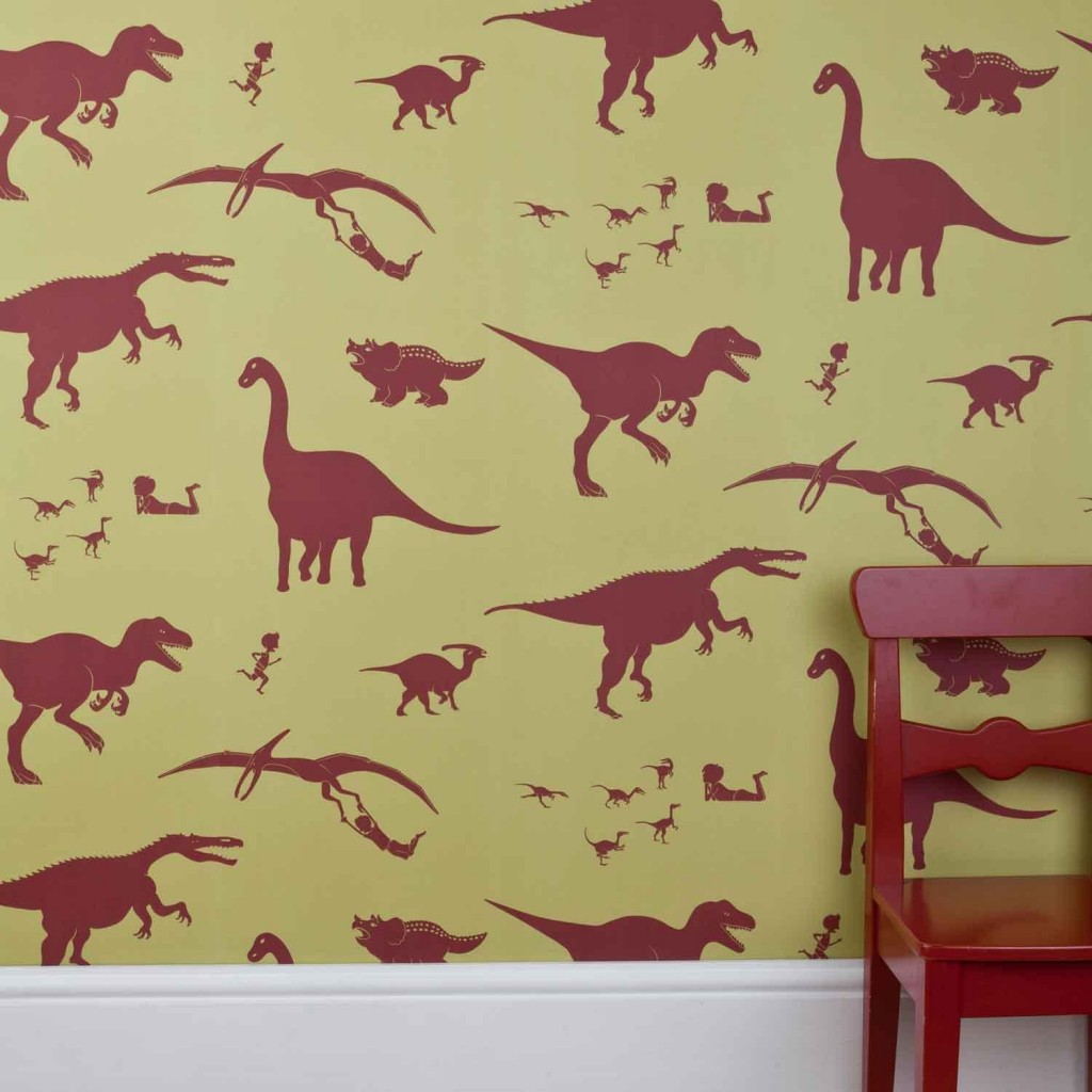
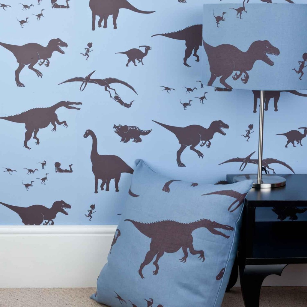
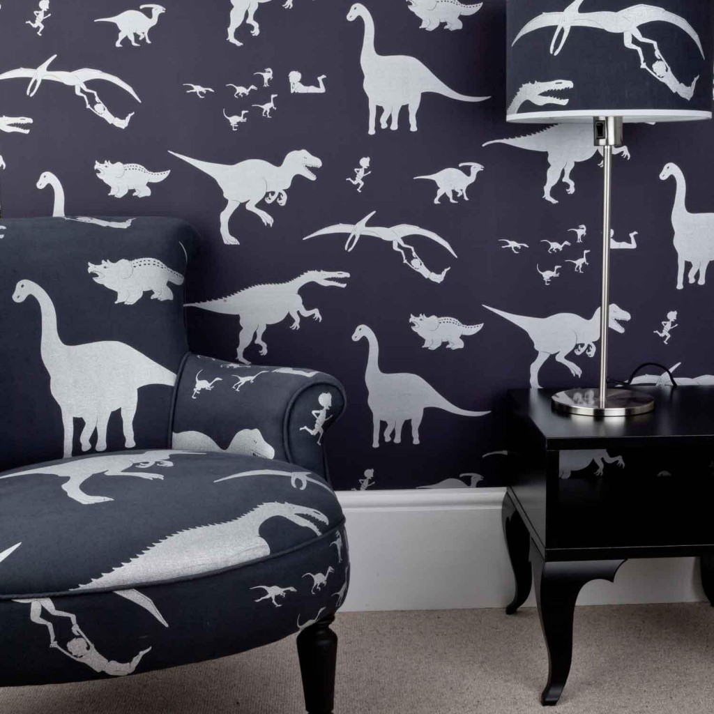
Here is another fun Decorex find from Blogtour London to share with you. Paperboy caught me eye because I am a wallpaper junkie. These original designs are so creative and not cloyingly sweet. Read the story Paperboy and how they came to be.
Enjoy!
The PaperBoy Story
We make boy’s wallpaper and fabric that feels crafted, that’s good quality, that’s thoughtful and has personality. That even has a sense of humour. We make children’s wallpaper and fabric where boy’s themes meet grown-up style. Two opposing concepts coming together.
We hope you like what we’ve made.
Inspiration.
PaperBoy was conceived when two six year old boys, Rory and Archie, outgrew their nursery-style room and needed a place that they (and their mum, Victoria) could be proud of. So she thought about what made a beautiful house. A place with a few lovely, classic things. A place with designs and materials that sing. That’s filled with colours and shapes that have a sense of harmony and intrigue. That makes you feel somehow calmer, more comfortable. As if the world is really rather fine. Somewhere that might even make you smile. And she thought wouldn’t it be great if you could find designs that did this for the boys? But she couldn’t find any.
There’s nothing in the world for boys that’s nice.
She was looking for boy’s wallpaper and fabric that felt hand-made, but wasn’t folksy or whimsical or twee. Something more pleasing than tacky, standard licensed wares. But affordable, too. Something classic, even iconic, but with an edge. Bang-up-to-date modern, but with room for nostalgia. Enough fun for little kids yet cool enough for bigger ones. And lovely enough to fit in with a beautiful, grown-up decoration scheme.
Well made, slightly subversive. And funny.
So she gave up looking and got on with making. She liked the hand-made look so she drew the images. The boys she asked liked ‘edgy’ images, from graffiti to slightly scary skeletons. And more classic images like pets, puppets and dinosaurs. And they responded in a surprisingly sophisticated way to colour, simplicity and texture. She came up with designs that would appeal to boys from pre-school to teens. Something for after the fluffy bunny stage that would see them through until they painted their bedrooms black.
Sorry, the comment form is closed at this time.


sherry hart
Love these!
Pingback: my favorites this week 10.11.13