2017 Trend Predictions with Stark Carpet
A fun bit of press to share from Stark Carpet a bit ago I forgot to share…
6 Designers Share Their 2017 Trend Predictions
2017 has hardly even begun – what will be at the forefront of this year’s interior design inspiration?
To find out, we picked the brains of 6 top designers; some we’ve spotlighted in our Designer Interviews, others have been featured on our Before & Afters, but each has their own unique ideas about what 2017 will bring to the design world.
Alyssa Kapito of Kapito Muller Interiors:
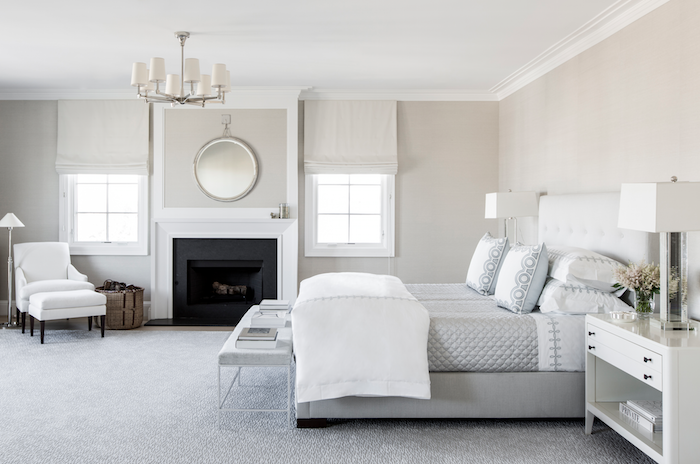
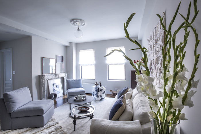
We are all about tone-on-tone palettes right now and rugs with very minimal pattern, if any at all. It’s best if the rug has a little silk in it, as the slight glossiness adds a lot of texture. Overall, the effect is very soothing and clean. It’s a very chic look in a bedroom or living room.
This bedroom designed by Kapito Muller is a calming display of a monochromatic color palette, with Glitz in Sterling on the floor.
Jody Lichtenstein of Home by Jody:
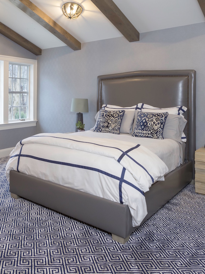
Navy as a neutral. Gray and white have recently taken center stage, but people are craving a classic color to go with them. Lilac and lime are lovely, but navy can be used on a much larger scale. Navy is commitment worthy.
In this bedroom, designed by Home by Jody, classic navy on Dax carpet grounds the space.
Timothy Corrigan of Timothy Corrigan, Inc.:
Performance in the home: People are no longer willing to sacrifice beauty for comfort and practicality. Options for high-performance textiles and materials continue to grow and improve for every part of the home in order to meet this demand.
High-performance fabrics in this Timothy Corrigan-designed living room, featuring a rug from the STARK Orientals collection, mean no worries for pets or spilled drinks.
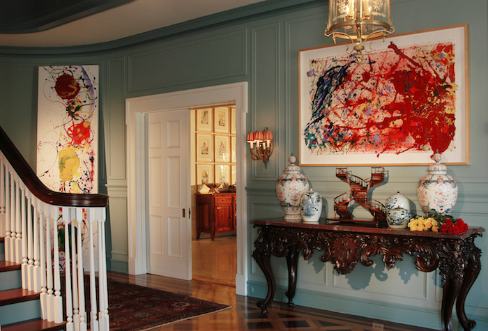
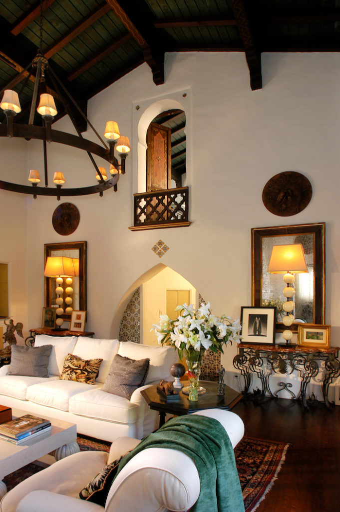
Different styles: People want their homes to reflect their individual personalities more and are looking to create a mix between different styles; not specifically any single style. Mid-century modernism or Tuscan style are yesterday’s news.
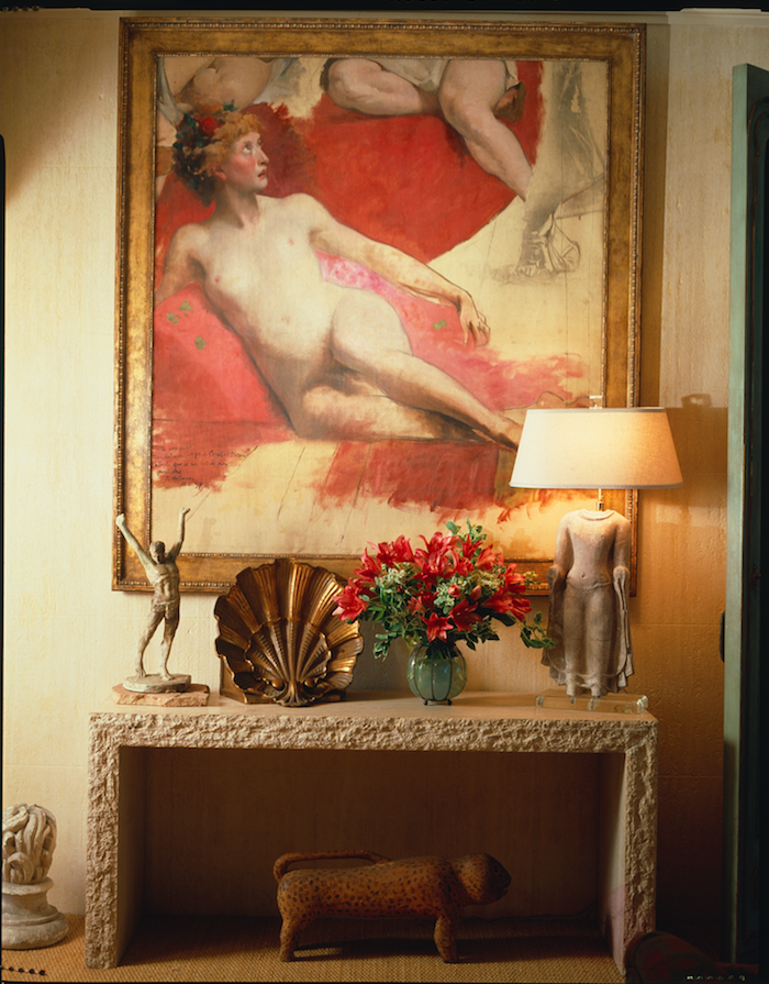
This mix of Timothy Corrigan rooms show a combination of styles, periods, textures, and countries of origin, each in one space. The first two feature rugs from the STARK Antique Orientals collection, while the last features a Chinese Seagrass design from our Sisal & Outdoor Collection.
Brett Eleanor Helsham of Brett Helsham Designs:
Although “Greenery” is Pantone’s color of the year, I feel what it stands for is the real trend: new beginnings. In this climate of global unrest, we not only want to come home and feel safe, but come home and recharge. It certainly is a time for new beginnings; with our interiors, I see this being satisfied in two ways: bright, happy and uplifting jewel tone colors, or keeping it minimal with earthy, relaxing, calming tones with more subdued hues like olive, terracotta, and sand.
Whichever palette you lean towards, I think mixing that with texture, like nubby carpet or ribbed pillows, will play the biggest role and are easy fixes to giving your space – and you – the uplift it needs!
In this bedroom by Brett Helsham featuring Ebbe and Flow on the floor, minimalism is complemented by the bold blue and nubby texture of the uniquely shaped seat.
Holly Hollingsworth Phillips of The English Room:
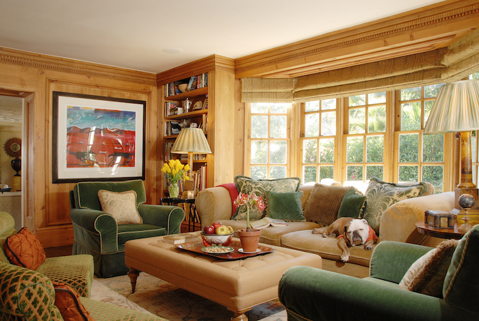
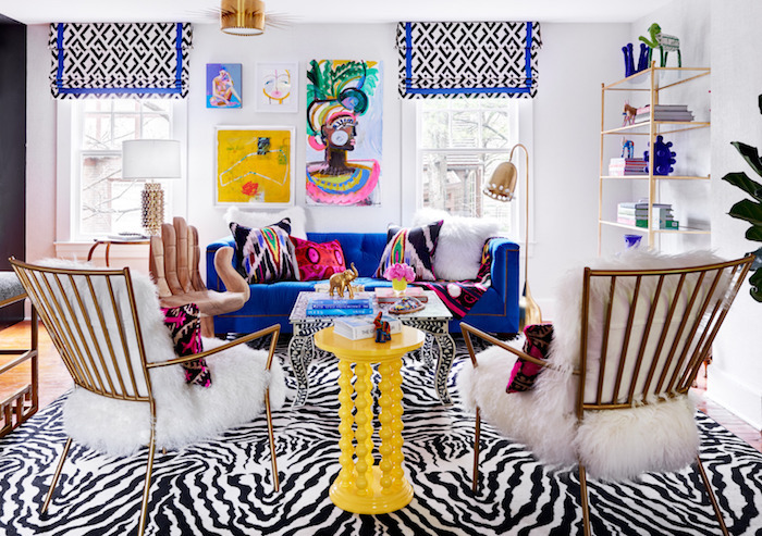
Animal prints may not be new in the design world, but they have not lost their usability for a number of reasons. They do the miraculous in design: provide camouflage when used on the floor. Antelope and leopard patterns are the perfect carpet for any family room with children and/or pets, as the spotted hides have built-in brown spots to hide the dirt and mud that often come along with a busy life.
Zebra, while a more exotic choice, also livens up a space with its bold stripes. No room is complete without a dash of animal print. The plethora of new choices flooding the market in textiles and carpet certainly illustrates the growth and longevity of this trend.
The Zebra Ax on the floor in this bedroom designed by The English Room stands out while centering the space with style.
Melissa Warner Rothblum of Massucco Warner Miller Interior Design and Decoration:
Larger than life art!
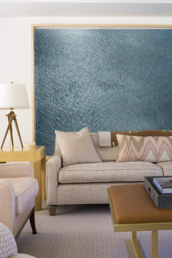
In the past, people seemed to shy away from art that seemingly would take over a space. More and more we’re seeing our clients not being afraid to go for large and bold pieces, and to use them in a way that is a little unconventional, like behind a sofa as pictured here in our Hidden Hills project. We think the days of art hung only at eye level where you can see every square inch of it are gone. People will start using it as a stunning backdrop, as well.
In this Massucco Warner Miller-designed room, with Brandyce in Stone on the floor, art practically takes over an entire wall.
Want to know more about some of these designers? Check out our interview with Timothy Corrigan; our interview with Alyssa Kapito of Kapito Muller Interiors; and our Before & After featuring a candy-colored transformation by Jody Lichtenstein of Home by Jody.
Header image courtesy of Timothy Corrigan, Inc.
Be sure to subscribe to THE ENGLISH ROOM for extra news, giveaways and discounts.
Let’s get friendly on Facebook, Twitter, Pinterest, Tumblr & Instagram.
Please feel free to contact The English Room if you are interested in our interior design services.
Sorry, the comment form is closed at this time.



J Lutsi
Love the room with the zebra ax rug. So alive! Can you please tell me who makes the fabric used for the window treatments in this room? I love this fabric!!!
Warm regards,