2017 Kitchen of the Year Contest Winners
Crème de la Crème via Atlanta Homes & Lifestyles
The 2017 Kitchen of the Year Contest winners prove that it is possible to marry the practical and the pretty in one of the most-frequented spaces in the home—if you balance hardworking design details with timeless touches.
Forever Young
Clary Bosbyshell infuses a 1930s Ansley Park kitchen with modern patina.
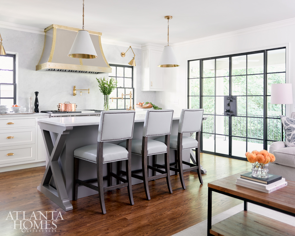
When Ansley Park homeowners Steve and Emily Lovoy sought to add updated elements to their traditional 1930s home, they enlisted designer Clary Bosbyshell, who nudged the couple to incorporate creative additions and fresh materials.
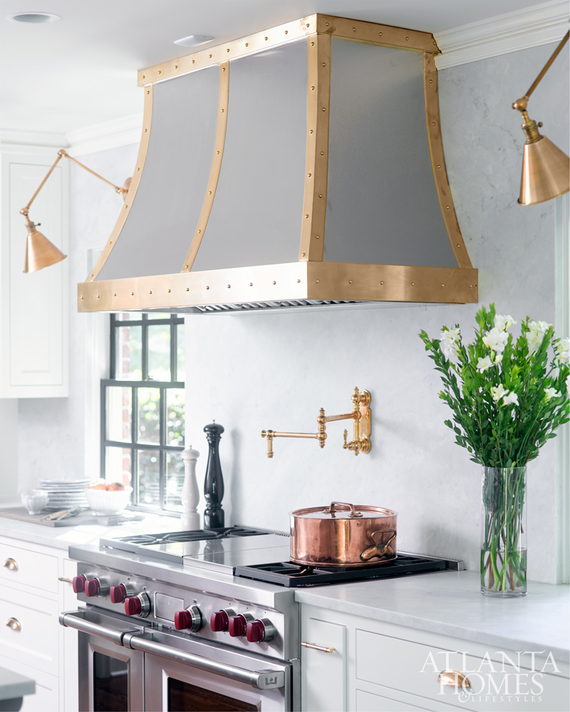
To that end, the designer focused on mixing metals and clean, functional design to create a young, modern aesthetic that fit the space and the family’s lifestyle. Bosbyshell designed a zinc vent hood with unlacquered brass strapping to tie in with the kitchen’s unlacquered brass hardware and faucet/pot filler.
“What I love about unlacquered brass is how it patinas over time,” Bosbyshell says. “It gives that warm and lived-in feel.”
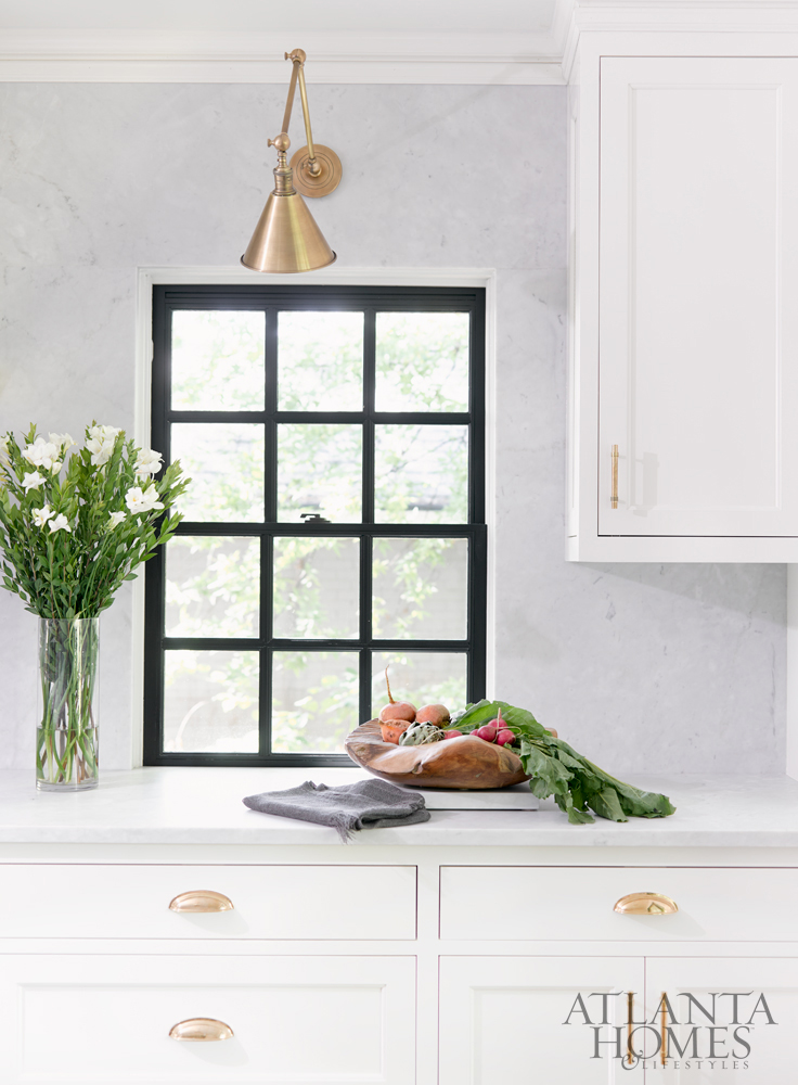
Glass panes in the room’s steel-framed doors allow natural light to flood into the kitchen at certain times of the day, while library lights over the windows and ceiling pendants over the island create mood lighting at dusk and at night.
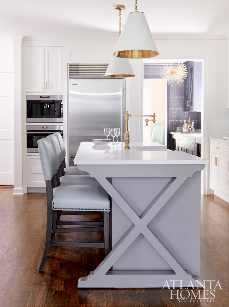
The island has a simple front but got the x factor, literally, with the designs on each end. “It is clean but with a hint of something aesthetically cool with the x,” she says.
Bosbyshell, also a mother, understood the desire to balance beauty and function in a family kitchen. To maximize space, pullouts hold kitchen items the homeowners use regularly, such as cookie sheets, a spice rack and Le Creuset cookware. The farmhouse sink is deep enough to hold larger items such as a Dutch oven, and faux leather on the barstools makes it easy to wipe up spills.
White Carrara marble on the backsplash, countertops and cabinets creates a clean look amid the aged aesthetic of the metal tones, gray island and dark window mullions. “We’ve done a lot of things that can really transcend time,” says Bosbyshell.
INTERIOR DESIGN Clary Bosbyshell, Margaux Interiors Limited; margauxinteriorslimited.com ARCHITECT Francis Kirkpatrick BUILDER AND CONTRACTOR Kevin Kleinhelter, K2 Construction; k2atlanta.com CABINETRY AND ISLAND custom through K-2 Construction LIGHTING Circa Lighting and Lamp Arts HARDWARE Colonial Bronze Company BARSTOOLS Bernhardt PLUMBING FIXTURES Watermark through PIRCH SINK Shaws
Subtle & Sleek
Designer Lauren DeLoach creates a fresh yet traditional hub for a family’s new home.
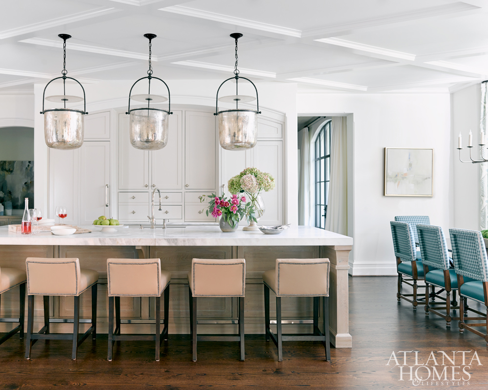
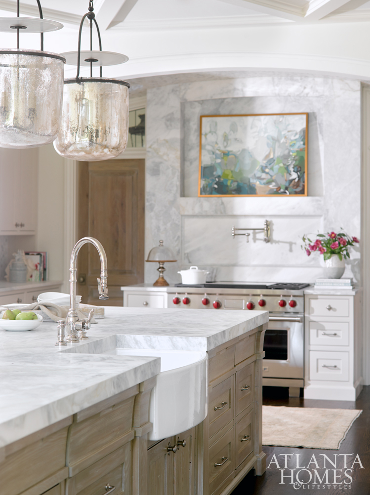
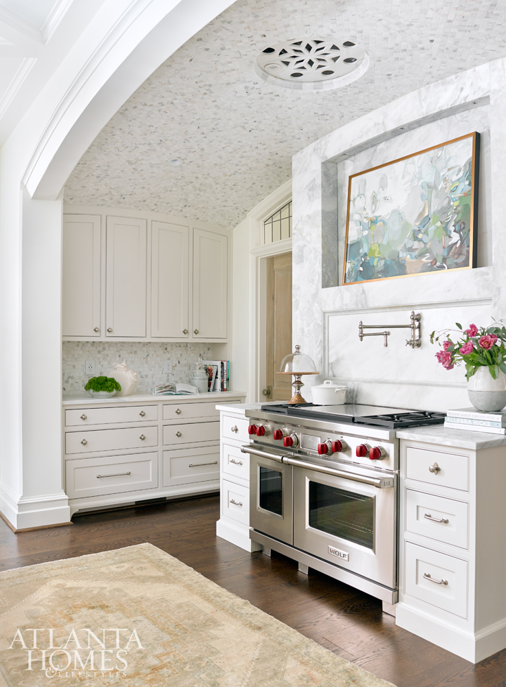
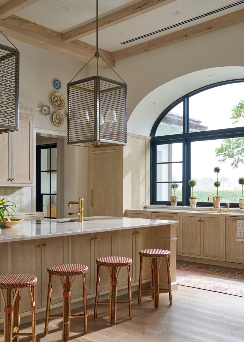
By themselves, the arched tiled ceiling, floor-to-ceiling curved iron windows, limed-oak island and marble backsplash could each steal the show in this Marietta kitchen. But together, the elements work as a team with blockbuster results, as did designers Lauren DeLoach and architect and builder Rick Greene, who collaborated with homeowners Allison and Robb Borden.
“It was a true partnership and became such a friendship afterward,” says DeLoach.The Bordens and Greene drew the plans for the kitchen and designed details such as the cabinets and the tiled alcove that serves as the range hood. Even the look of the center ceiling medallion was carefully considered.
Subtle variations in texture (in the form of polished and mosaic tile) and color, such as pale-putty cabinets and the limed oak on the island, result in a classic kitchen with a twist. The island’s wood grain transitions to the solid finish on the Carrara marble countertops and pewter hardware. Even the marble slab selected for the backsplash shifts from gray to taupe to hints of green.
“It just has such a range of color. We didn’t want it to be too austere,” DeLoach says. “We loved how it picked up on the warmth of the wood we were using and kept it cool at the same time.”
The kitchen serves as the hub for a family of six. Bells and whistles include a TV hidden behind the marble slab over the range, which is on a hydraulic lift and recedes into the ceiling. The result is a harmony of sleek and traditional styles.
“Everywhere you look, there’s something interesting, but not one thing overpowers the next,” DeLoach says
INTERIOR DESIGN Lauren DeLoach, Lauren DeLoach Interiors; laurendeloachinteriors.com BUILDER AND ARCHITECT Rick Greene, Richard W. Greene Inc. CABINETS AND ISLAND Jamestown CEILING TILE Traditions in Tile and Stone COUNTERTOPS AND BACKSPLASH Mega Marble LIGHTING Circa Lighting HARDWARE Ashley Norton APPLIANCES Sewell Appliance PLUMBING FIXTURES Waterstone SINK Shaws ARTWORK Gregg Irby Gallery TABLE Beau Studio CHAIR FABRIC Chelsea Textiles DRAPERYGalbraith & Paul through R Hughes RUG Oriental Accents
Worth the Wait
An artist’s longtime yearning for a kitchen face-lift comes to fruition in gleaming style.
Courtney Walker’s clients accumulated two years’ worth of ideas before beginning their kitchen remodel, but they needed the designer’s expertise to help blend them together and effectively execute their vision.
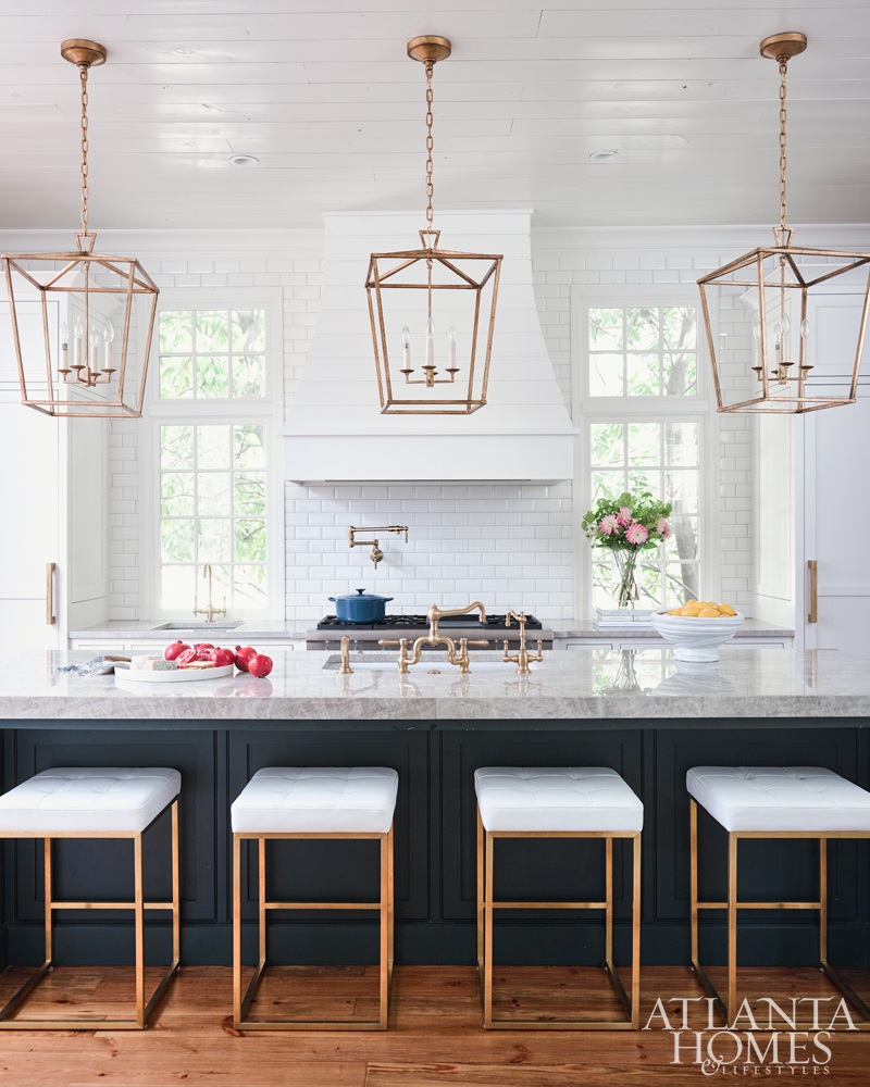
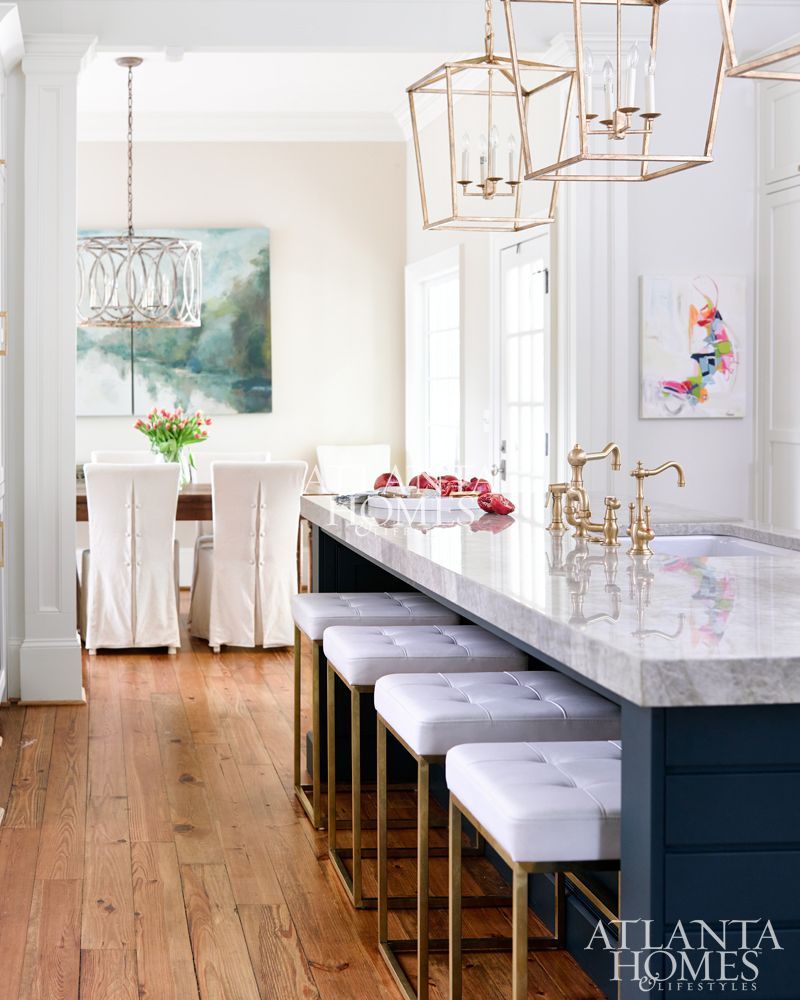
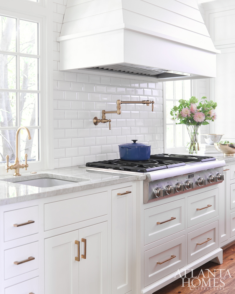
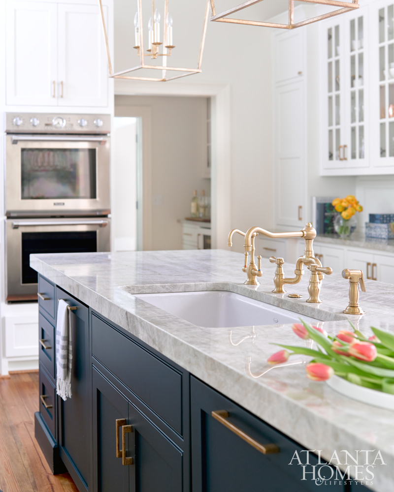
Pictures of brushed-brass lights on an inspiration board created by Walker’s client, an artist and gallery owner, dictated the finish for the plumbing and hardware. But using brass in multiple places required Walker’s powers of persuasion. After all, her client’s husband had removed all of the shiny brass doorknobs when they moved in a few years ago. Walker sent photos to show him that today’s brass finish is nothing like the brass of the ’80s.
The rubbed-down brass fixtures now blend with the three Darlana lanterns in a gilded iron finish over the island. Gold specks and veining in the white Victoria Falls quartzite countertops tie in with the fixtures and complement the navy blue island (in a matte finish), which also features brass barstools.
Widening the opening made the already-large kitchen an even more dramatic space, and Walker replaced the tiny island with one large enough for two dishwashers and wrapped it with shiplap siding. The shiplap, which Walker suggested, continues on the ceiling and the custom-designed range hood set against white subway tile.
Other distinctive features include a drink station, prep sink, breakfast bar and family workstation, as well as functional extras such as a warming drawer and new windows.
“It’s a bright, wonderful kitchen,” Walker says. “It puts a smile on my face every time I see it.”
INTERIOR DESIGN Courtney Walker, C. Walker Designs; (404) 256-1333; cwalkerdesigns.com CONTRACTOR Chris Wooden, Wooden Enterprises; (404) 886-0173 CABINETRY AND RANGE HOOD Keystone Millworks COUNTERTOPS Marmi Natural Stone LIGHTING Circa Lighting PLUMBING FIXTURES Ferguson SINKS Kohler FAUCETS Newport Brass APPLIANCESBuilder Specialties BACKSPLASH Traditions in Tile and Stone HARDWAREAshley Norton through Architectural Accents
Be sure to subscribe to THE ENGLISH ROOM for extra news, giveaways and discounts.
Let’s get friendly on Facebook, Twitter, Pinterest, Tumblr & Instagram.
Please feel free to contact The English Room if you are interested in our interior design
Sorry, the comment form is closed at this time.





Gregg Irby Gallery
Love all of these spaces. Thank you for including us!