12 Must-Read Decorating Tips via OKL
Annually, at the conclusion of the year I purge my design magazines. Historically, I save my favorite tear sheets and add to my files of upon files of design ideas.
Over the years those files have dwindled and Pinterest has become my file cabinet and blogs are my source of inspiration.
Today, I was checking One Kings Lane home tours to see what I have missed. It turns out, I missed a great one.
12 Must-Read Decorating Tips from a Rising Design Star
Tour a gorgeous Santa Barbara home decorated by up-and-coming designer Megan Rice Yager, and steal her genius design takeaways.
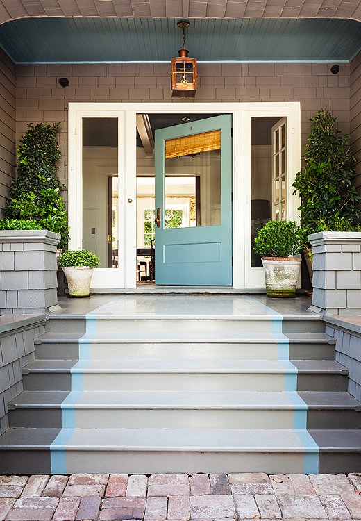
The door color, Benjamin Moore’s Stratton Blue, is continued into the foyer. A light from Bevolo casts a warm glow on the porch when night falls.
Tip No. 1
What’s on the Outside Counts
“The exterior of your home is where first impressions are made. It can make guests excited to see what’s inside! I painted a runner up the stairs to draw you into that gorgeous front door.”
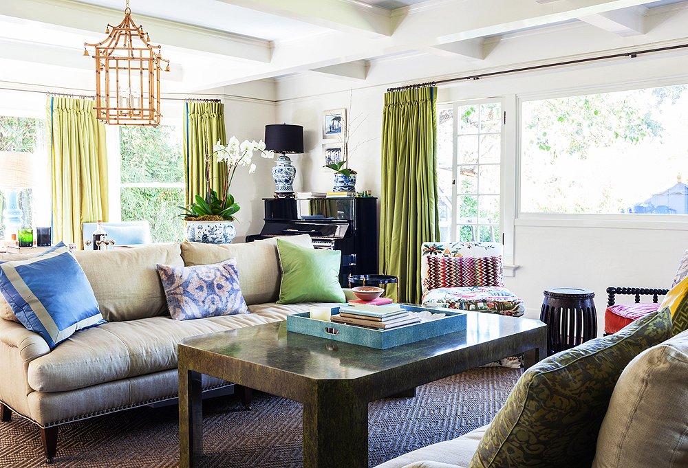
In the living room, Yager opted for a “chinoiserie overload”—bamboo lanterns by John Rosselli and plenty of blue-and-white ceramics—letting the Asian influence complement the home’s Craftsman bones.
Tip No. 2
Rely on Symmetry—to a Degree
“You’ll never see me setting things at a jaunty angle in a room—it gives me the willies when I see a rug placed on the diagonal. I love symmetry, but I am also conscious not to overdo it. For instance, I’ll use chairs that are like fraternal twins—not perfectly matchy-matchy.
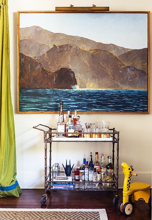
A fully stocked bar cart (who doesn’t love a portable party?) and a painting by Garrett Speirs create a moment on an otherwise empty wall.
Tip No. 3
Go Big When It Comes to Art
“I love playing with scale in a space, and I’m a major fan of large-scale art. It feels more modern.”
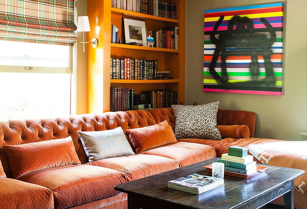
Yager transformed this spare room, an “empty box, ” into a comfy den with built-in bookcases and a custom sectional upholstered in Schumacher’s Paley Quilted Velvet.
Tip No. 4
Don’t Shy Away from Major Color
“I love when clients are open to bold color. It can have such impact in a room—really it’s the oldest trick in the book. I just always like to continue at least a bit of the same color from room to room to maintain a visual continuity.”
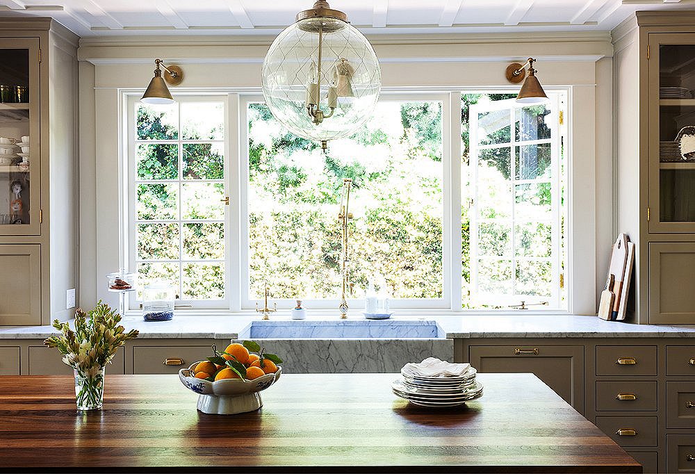
Though the kitchen is new, Yager referenced the original woodwork on the ceilings and brought in traditional touches, from the old-fashioned cabinetry to the island built to look like a French chopping block, complete with brass corner straps.
Tip No. 5
Let Your Lights Hang Low
“I generally don’t hang fixtures higher than 30 inches above a table surface. Light fixtures hung too high are like high-water pants—and not the cool Thom Browne kind.”
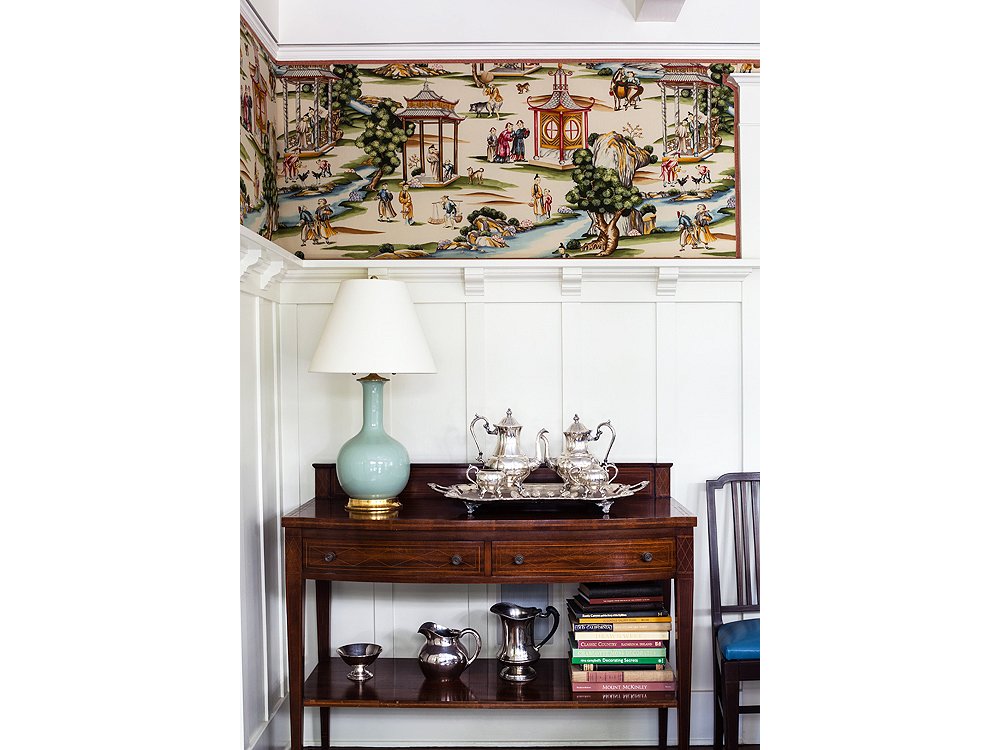
Yager upholstered these panels in Scalamandré’s Shanghai. Hits of pale blue in the fabric are set off by a lamp from Christopher Spitzmiller.
Tip No. 6
Rethink Wallpaper
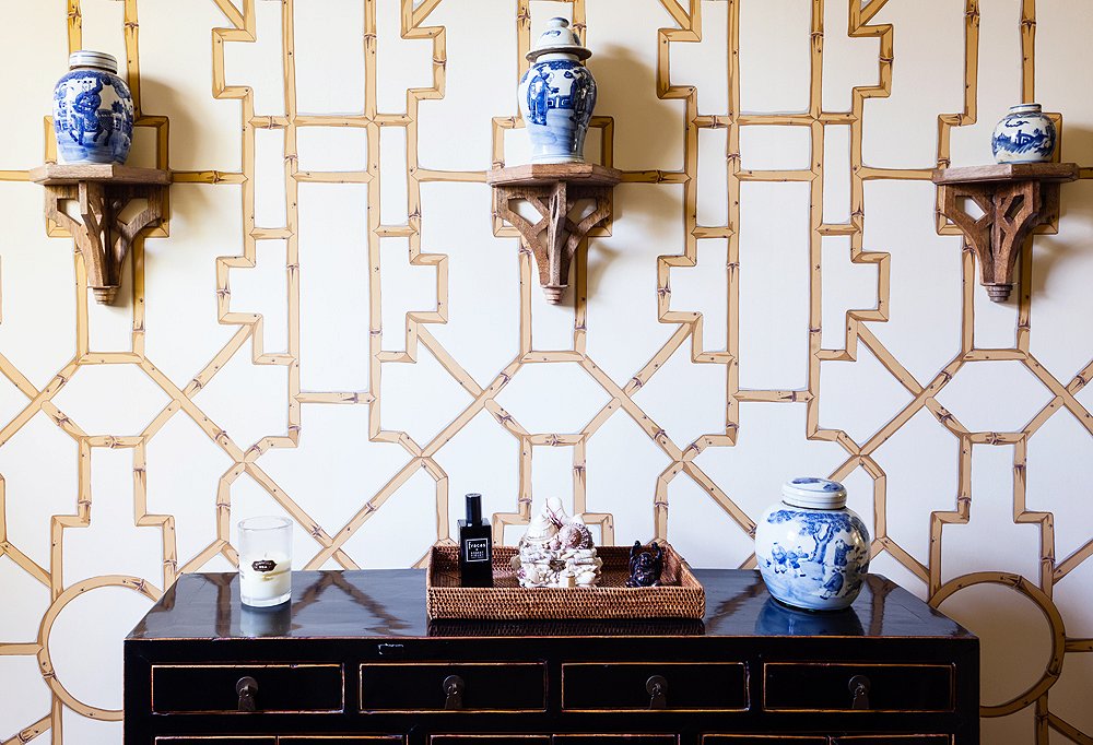
Baldwin Bamboo wallpaper from Scalamandré creates a graphic backdrop to ginger jars resting on Ballard Designs’ brackets.
Tip No. 7
Curate a Collection
“I love collections—they make a house feel so personal, and they can be really affordable. A great container filled with matchbooks from your travels looks cool and costs nothing. I personally never met a foo dog I didn’t want to adopt, and they can be found in every shop in Chinatown for very little.”
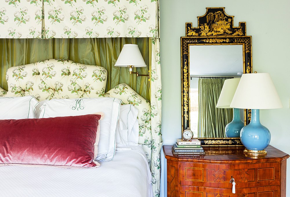
Yager designed the lovely pelmet treatment in bed drapery and headboard in Bowood by Colefax and Fowler. Another Christopher Spitzmiller lamp rests atop a vintage chinoiserie chest.
Tip No. 8
Make Your Bedroom Your Sanctuary
“I would live in my own bed if I could! (Robert Louis Stevenson’s “The Land of Counterpane” was my favorite poem as a child.) I really like to create ultracozy beds for clients with beautiful linens, a perfect mix of soft and firm down pillows, and good lighting for reading.”
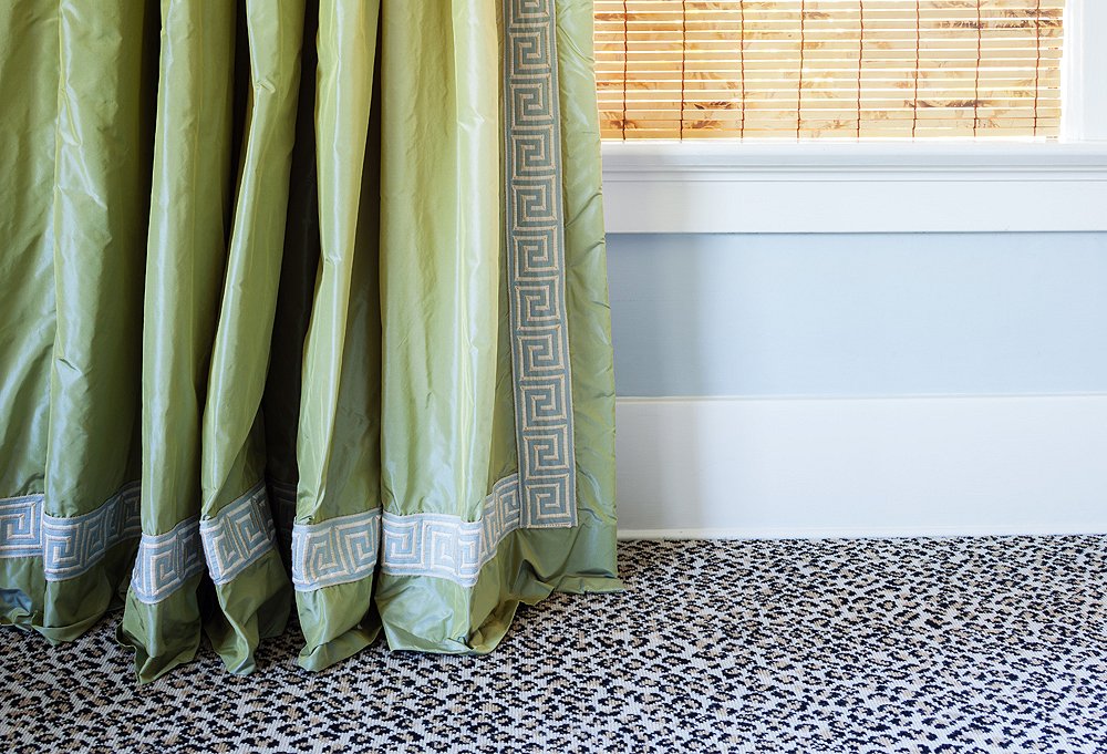
The green taffeta curtains with Greek key trim display the 1-inch break that Yager swears by. Their juxtaposition against the leopard carpet is one of her favorite moments in the house.
Tip No. 9
Go for Twists on the Traditional
“When it comes to mixing prints and patterns, I don’t really believe there are any hard-and-fast design rules that must be adhered to. But my designs generally reference tradition, which then lets me feel free to experiment within that classic framework.”
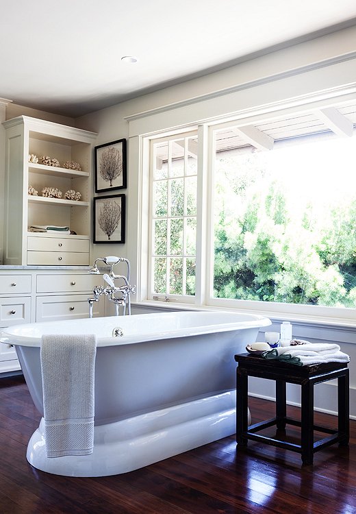
The clients’ own seashore-inspired accents add a serene touch to the bathroom.
Tip No. 10
Know When Less Is More
“As much as I love mixing things up in the rest of the house, I really like for bathrooms and kitchens to appear fairly utilitarian and classically simple—not too ‘decorated.’”
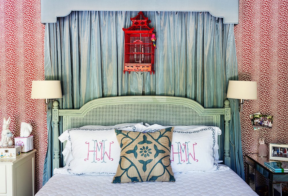
Rose Cummings wallpaper sets off the taffeta bed draperies. Wall lamps (these are by Visual Comfort) free up space on the nightstand.
Tip No. 11
Give Kids Rooms They Can Grow Into
“Ideally, bedrooms should be able to easily transition with kids as they enter their teen years. In this room for the client’s daughter nothing is too little-girly.”
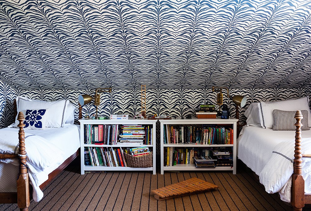
Zebrine wallpaper by Rose Cummings plays the star in this tots’ room, while the dark but neutral carpet takes more of a supporting role.
Tip No. 12
Balance Is Key
“Some things in a room need to exist as the chorus—not everything can be a star. It can feel too busy when every last thing is embellished.”
Be sure to subscribe to THE ENGLISH ROOM for extra news, giveaways and discounts.
Let’s get friendly on Facebook, Twitter, Pinterest, Tumblr and Instagram.
Sorry, the comment form is closed at this time.



Mitchell
I totallly agree with you!Good opinions.
https://www.shopstylebrand.com